I’m passionate about creating beautiful books, and while a pitch-perfect cover makes for a great first impression, readers are going to spend the slow burn of a book with the interior book layout. I love creating a smooth reading flow, margins that give a story the right about of breathing room, and an immersive reader experience.
But as more authors turn to self-publishing to find their audience, more of them stumble into newbie formatting mistakes in their efforts to create really readable books. Many indie and hybrid authors are publishing quick-to-market books with streamlined budgets, and custom book design doesn’t always fit that modus operandi.
The Solution
So this summer, Looseleaf’s first-ever intern (Rachel Hulet) and I developed industry-standard, elegant book design templates to make reliable, reader-ready book design more affordable, accessible, and adaptable.
We made five templates tailored to specific genres and tones. Each one has everything you need for print and ebook interiors (plus bonus cover templates). The templates (along with tutorials and blog posts about book design techniques, software, and ebook considerations) are now all available at BestBookTemplates.com. More templates are on the way (probably one every 3-6 months), and I plan to post at least once a month with either new tips or a video analyzing a real book design by a different designer.
The Templates
Custom book interiors are still very important here at Looseleaf, but if it’s outside your budget, consider either a DIY template or a template + typesetting assistance to get your book reader ready.
Scáthach (Fantasy)
Scáthach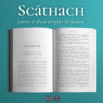 is designed for fantasy novels and novellas. Everything is tailored for a high fantasy feel, and the kit has specialty text options to support all the immersive elements of your story. It includes options to put epigraphs at the start of chapters, an elegant unicase font for all the titles, and easy-to-use styling for letters and blockquotes, poetry, and more.
Joyce (Literary & Memoir)
Joyce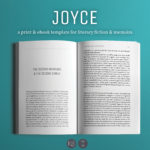 is designed specifically for character-driven narratives with strong themes. It features simple but striking horizontal lines to set off chapter starts, scene breaks, and section/part dividers, and the body text feels at once both classic and contemporary. It’s particularly genre-fluid so long as the book at hand trends more literary. So far, Joyce is the most popular template in the stable.
Enceladus (Science Fiction)
Enceladus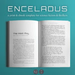 sits on a design boundary that makes it a good fit for both tech-heavy science fiction and techno-thrillers. It includes special text styles not only for the usual letters and poems but also for computer code and other digital comms. Chapter starts have options to include (or not) timestamps that are common in thrillers in which knowing the time and place is essential and space operas that span various planets and solar systems.
Meet Cute (Contemporary Romance)
Meet Cute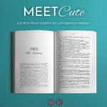 is one of two romance-genre templates we have right now. It works best for books with electrifying first meetings and beautifully complementary characters, and it has specialty text options to support all the details of a modern-day happily ever after. (And if you employ one of the options that doesn’t use the cursive font, it can be a solid choice for other contemporary fiction!)
Dashwood (Historical Romance)
Dashwood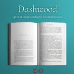 is the second romance template, and it’s tailored for an elegant, period-piece experience. It also includes options for time and location stamps for books that really dig into their time-and-place research.
The Training
BestBookTemplates.com is also where all my future articles about book design will post first, but I’ll post a quarterly digest of all the articles and videos here on LooseleafEP.com.
Font Licensing for Ebooks. If you’re particular about type design, ebooks can present special challenges because font licensing for ebooks is different (and usually more expensive) than licensing for print book design.
Book Design in the Wild: The Phlebotomist. There are many places to find book design ideals—design textbooks and blog posts seem happy to provide rules and regulations for creating the perfect book layout. But in my own study, I found that pages set up using the golden ratio and perfectly harmonious margins were hardly the norm, even when the book design worked well for the project and its audience. So I started making videos about real books with real-life constraints and solutions.


Leave a Reply