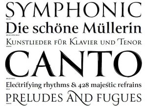
 Although I may not have enough knowledge to be considered a font nerd, I’m certainly a fan (I leave the nerding to other members of the Looseleaf team). Last week I got an email from Font Bureau announcing its newest font family: Canto, designed by Richard Lipton.
I’ve gotten a few announcements from Font Bureau since I joined its mailing list, but Canto is the first new release that really piques my interest.Check it out. Look at the PDF sample. Look at closeups of the different options. Elegant, fun stuff. I’d love to see the bold brush style on a book cover somewhere. The optional swashes (like the fancy N in and at the bottom of the snippet I show in this post) and optional ligatures give it a lot of diversity and plenty of options for titles. (Look at the Canto characters sheet to see what each character looks like and what the optional characters bring to the table.)
Canto is a bit like Trajan, which is probably a typeface more of you are familiar with, only it has more options and an organic touch.
For any of you who aren’t familiar with professional fonts, no, Canto is not free for download. Richard Lipton and the other folks at Font Bureau need to make a living too, and I’m sure this beauty took a good chunk of time and effort. It is available for purchase, and you can buy individual styles or the whole family. If you’re an indie author looking for a brand font, Canto wouldn’t be a bad option to look into.


