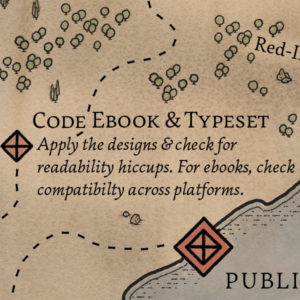
 It’s time to get the gang back together! Earlier in your book journey, you split the party to tackle initial design work and copyediting at the same time. Now you need to bring your polished text and your design tools together to create print-ready files and distribution-ready ebooks. This is where the Design Pines and the Red-Ink Woods meet.
Typesetting
Earlier in the Design Pines, you had a book designer create a style and system for transforming your manuscript into a fully designed book.[1]A manuscript is a plain, simple thing—double-spaced, 12-pt font, etc. It’s not meant to look like a finished book. Once that designer has your copyedited manuscript, they can apply that style to the entire book and copyfit it page by page.
Copyfitting is the nitty-gritty of book design, where the designer checks for bad hyphenations, word stacks, and other typographic wrinkles that can disrupt a reader’s immersion in your book. It’s also how your book designer makes sure chapters don’t end with one lonely line on a page by itself.
At the end of this process, your typesetter gives you a gorgeous print-ready PDF with all your words tidily placed on the page. These pages look ready for real readers—but don’t run off to the printer just yet. (Hop to “Where to Next?”) This is also when you can finalize the spide width for your print cover.
Ebook Formatting
While in a print book your typesetter has significant control over where words fall, ebooks are a different beast. Unless you’re publishing a comic book, a picture book, or a similarly graphic-based project, it’s usually best to use a reflowable ebook format. Reflowable books make up the vast majority of ebooks on every ereading platform.[2]If you are using a graphics-heavy format, your book might be better suited to what’s called a fixed-layout ebook.
Reflowable books can—like their name suggests—reflow to fit different screens and platforms, and readers can adjust the type size, font, and other features to suit them. While this flexibility can be frustrating for designers, it’s also an amazing gift. Readers who prefer larger text no longer need to wait for large-print editions, folks can read your book on ereaders and tablets and phones interchangeably, people can choose fonts that are easier for them to read (even fonts tailored to help with dyslexia), and a well-prepared ebook is a lot more accessible than print for people who are blind (because the books can be read by screen readers).
So don’t expect your ebook to look exactly like your print book. Instead, embrace the flexibility of the medium and the way it makes your books easier to access for more readers. Ebooks can still do very cool things, from a design perspective, but they do them in different ways.
Your ebook formatter should be aware of this flexibility and should keep an eye out for accessibility issues and ways to ensure your book remains readable no matter what a reader chooses to do with the reflowable options on their end. (Many automatic conversion services leave a lot to be desired in terms of accessibility.) Your formatter should also test your book on multiple platforms. Although Amazon’s Kindle has the lion’s share of the marketplace, it’s often still worth making your book available on Apple Books, Kobo, B&N, and other platforms (plus you might want the option to sell directly to readers from your own site!).
One last possible bump in the road for ebooks: usually you need a separate license to use a font in an ebook, even if you already have a license to use it for print books. Make sure to check your font licenses for permission to embed fonts in ebooks. If you don’t have a license for that, you’ll need to purchase an ebook-specific license or find the closest open-source approximation for the fonts you’ve used.
Help Along the Way
I already discussed a host of resources on typesetting and book design in the Design Pines post. These help resources focus on the ebook side of things.
- Always check the platform requirements. Different platforms support different features and have different requirements for achieving the same end goal. Ebook design is like web design in that you have to find the best option for variable parameters. (Ebook design also uses HTML and CSS—ebooks are basically mini websites.) Some platforms have step-by-step ebook creation guides too.
- There are lots of software tools to help you build good ebooks. I always use InDesign, Sigil, and Kindle Previewer in my ebook workflow process. I sometimes use Adobe Dreamweaver or a free text-editing tool, and I know folks who rely heavily on Calibre and Kindle Create. If you aren’t hiring a professional, do your best to understand the strengths and limitations of each tool. That way you know what you’re getting into.
- There are amazing professionals out there to help. Locally (for me), the Utah Freelance Editors database has listings for print and ebook formatters. You can also check the #eprdctn hashtag on Twitter for ebook pros giving each other tips (and commiserating about roadblocks).
Where to Next?
Once your book is set up in its publication-ready form(s), it’s time for a picnic among the Proofreading Boulders. This is where you can make a final pass (or two) to catch typos and formatting hiccups.


