• Skip to main content
  • Skip to primary sidebar
  • Skip to footer

Looseleaf Editorial & Production

Book Editing & Design

  • Editing
    • Big-Picture Editing
    • Line Editing
    • Copyediting & Proofreading
  • Book Design
    • Book Layout
    • Ebook Formatting
    • Other Graphic Design
  • About
    • The Team
    • Our Work
    • Find Your Fit
    • Testimonials
  • Resources
    • Resources
    • Events
  • Blog
  • Contact

Kristy S. Gilbert

Looseleaf Contest: Appealing to Readers with Your Writing Blog

February 1, 2012 by Kristy S. Gilbert 2 Comments

inkPageant

For the month of February I’m partnering with inkPageant, a writing blog aggregator, to bring you a contest you can enter by posting on your blog. There are two prizes:

  1. A 20-page critique (or 3 hours of copyediting, if you don’t have a manuscript ready)
  2. A 50-page critique (or 6 hours of copyediting)

The 20-pager will be given randomly (you can have up to 3 entries) and the 50-pager will be given to the person who writes the best post that appeals to both writers and non-writers (i.e. readers). I’ll explain how to enter your posts in the contest in a minute. First I want to explain appealing to readers and how you can do it without leaving your writing-related comfort zone.

Appealing to Readers

I’ve mentioned before that fiction writers who want their blog to attract readers need to learn to blog about something other than writing. The easiest way to do this, while still appealing to your writing buddies and improving your own writerly sensibilities, is to review something with a plot (e.g. books, TV shows, movies). Ideally you’re reading and viewing things that would also interest your readers, and the time you spend analyzing those works will help you develop your awareness of story elements in your own work.

You can also blog about things that will interest your reader and relate to the books you write. For example, horses interest readers, and writers who need to know about horses for their books could use a few prods in the right direction. Historical fiction, steampunk, and other genre readers may be interested in clothing styles for certain time periods, as will writers who write in those eras. There are entire worlds of topics you can write on, most of which will appeal to readers. (But if you only talk about the craft of writing, you’ll miss your mark.)

Readers also tend to enjoy satire of genre tropes and expectations, so if you’ve got satirical chops, funny always wins over readers.

How to Enter Your Posts

To enter the contest, register at inkPageant and submit your post to them. They’ll review your post and add it to their pages.

Winning the 20-page Critique. Any post, whether it appeals to readers or not, gets you an entry for the 20-page critique prize. You can have up to 3 entries (each blog post is an entry), and the winner will be chosen randomly at the end of the month.*

Winning the 50-page Critique. I will review every post inkPageant aggregates in the month of February, and the post I believe is of the best quality and best appeals to readers and writers will win the author the 50-page critique.*

____________________________
*If you’re already a Looseleaf client, or if you’re a family member of mine, you’re disqualified.

Filed Under: Contests, Publishing Tagged With: blogging, contests, inkPageant

Eye-Catchers: My Favorite Covers from 2011

January 30, 2012 by Kristy S. Gilbert 4 Comments

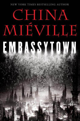
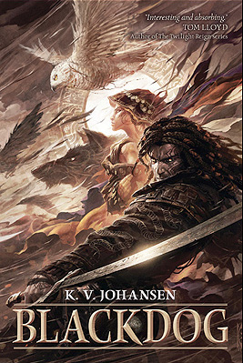
I haven’t analyzed a cover for a long time (not since Mira Grant’s Feed), but before the first month of 2012 passed I wanted to share with you my favorite covers from 2011 and why I think they work.* My top three are Blackdog by K.V. Johansen (illustration by Raymond Swanland), Embassytown by China Miéville (illustration and design by David Stevenson), and The Hum and the Shiver (photographs by Valentino Sani and Marilyn Angel Wynn). They all have excellent lines to draw the viewer’s eye and serve as compelling introductions to the stories inside.

Blackdog: A Study in Eye Movement

Blackdog by K. V. Johansen

There are a lot of things I love about this cover, but all of it hinges on the spectacular illustration from Raymond Swanland. The color scheme is striking even though it isn’t flashy, because Swanland has a nice contrast between the lights and darks that adds flavor and variety without having to be extreme; the image packs a lot of elements in without feeling busy; Holla-Sayan (the guy in the foreground) is compelling.

But the thing that strikes me the most about this cover is the motion. Everything is moving. The owl is in a dive (as are the other shadowy birds), and that dive moves in the same direction as the ribbons of cloth coming from Attalissa (the girl in the center). The contrast of the bright circle in the center with all the darker elements draws your eye, but then it’s easy for your eye to flow around the rest of the cover elements following the motion lines. Then you get caught up in the intersection where Holla’s hand and his sword meet, you move up to his face, and you get hit head-on with the fact that he’s looking out from the cover. His face is the only element that isn’t synchronized with the upper-right–to–lower-left flow, and because of that it strikes a strong chord.

This cover is a study in the power of eye movement. The movement sucks you in, and the illustration has enough detail to keep you captivated for a while. Definitely long enough to decide you want to buy whatever is behind that cover. (As a nod to whoever did the text, the title color contrasts well with what’s behind it, but harmonizes with the existing illustration. It’s placement also defers to the illustration, which is smart considering how strong the illustration is.)

Embassytown: Room for Imagination

Embassytown by China Miéville

The first think I like about this cover is the color scheme. You can’t get more contrast than between black and white, and red is my favorite accent color. It’s a striking scheme that never seems to get old (for me, at least; I’m sure other people are sick to death of it).

David Stevenson uses the red judiciously: he only uses it for the author name, which is a lightweight font compared to the title typeface, so the red remains an accent, but not the note that stays with you. Where the Blackdog cover had a lot of diagonal motion, this cover is strictly top-to-bottom. The contrast of the black and red (or the black and white, depending on the viewer) draws your attention to the top. Then your eye filters down through the inverted pyramid of the jumbled letters and finally to the city, which is made up of vertical buildings.

The space between the title and the bottom of the cover is the part I like best about this cover. The jumbled letters give you an idea that words are important to the city below. It gives you hints; it gives you an impression of what Embassytown, the city, is like; it gives the city both a glow and a shadow. Those hints and impressions and contrasts are interesting, and they’re ripe for a viewer to start creating a story of their own with the image, a story that will compel them to read.

The Hum and the Shiver: Simple Can Sell

The Hum and the Shiver by Alex Bledsoe

This cover is different than the other two because it relies on two images instead of on a specific illustration (if you’re a self-publisher thinking about a stock-photo cover, take note).  Neither photo would make as compelling a cover alone. The landscape image is full of beautiful color. The yellows and oranges in the sky catch the eye, and they do so all the better because they’re bordered by the unobtrusive blue of the mountains below.

The shape of the mountains draws down in a V that guides the eye to the central figure (the other image). Like the city and the jumbled words of the Embassytown cover, this figure lets you, the viewer, start to tell yourself a story. Here is a woman, partially transparent, holding a stringed instrument. Because she’s nondescript—you can’t really see her face, you don’t know exactly what she’s feeling—you have the freedom to fill in the gaps.

This cover is simple: the contrasting colors draw your eye, and the solo, nondescript figure lets you tell yourself a story. It’s powerful from an emotional sense, and it sets a beautiful tone for the book inside.

______________________

*Remember, I’m not extensively skilled as a designer. I’m decent with typography and word-based design, but not stellar when it comes to creation. I leave the illustration and design to my more able colleagues. You don’t have to be able to create awesome stuff to love awesome stuff and to be able to say why.

Filed Under: Publishing, Reviews Tagged With: Alex Bledsoe, Blackdog, China Miéville, cover design, covers, Davis Stevenson, design, Embassytown, K.V. Johansen, Raymond Swanland, The Hum and the Shiver, typography

Weekly Roundup: 1/20–1/27

January 27, 2012 by Kristy S. Gilbert 2 Comments

Angry Robot: The Return of the Open Door

Angry Robot LogoAngry Robot, a publisher of science fiction and fantasy, ran an open door submission policy for a month last year. They’re going to do it again, but with slightly different rules. They will only accept epic fantasy, and they will only accept submissions that follow the format and standards laid out in their open door submission guide. Unless you write YA, in which case any type of SF&F is cleared for you to submit to their YA imprint, Strange Chemistry. Submissions will be made through the Angry Robot website April 16–30. That means you have a few months to get your manuscript completed and finalized before you send it in.

(To learn more about my thoughts on Angry Robot’s publishing style, see my post here. I’ve also reviewed one of their books, Lauren Beukes’s Zoo City, here.)

Gini Dietrich: Reading Fiction Helps Your Career

Remember last week, when instead of posting a weekly roundup I posted about how important stories are? On Tuesday of last week, PR pro Gini Dietrich posted about the same thing, but in a different context. She cites a thick chunk of research to back up her claim that reading fiction helps your career. See? Stories are important to your daily life as well as to your world citizenship.

Digital Book World: Bookseller Backed by Big Publishers Advocates Abandoning Digital Rights Management

Anobii, a bookseller whose stakeholders include the UK arms of HarperCollins, Penguin and Random House, is hoping to leave DRM behind. They’ve got good reasons too, including trying to give Kindle users more options.

Filed Under: Publishing Tagged With: Angry Robot, Gini Dietrich, readers, submission guidelines

Buying Habits: Brick-and-Mortar vs. Online

January 25, 2012 by Kristy S. Gilbert 4 Comments

Bookshelves

I recently moved to a new city, and I’ve had trouble finding a solid brick-and-mortar bookstore (possibly because I know hardly anyone here, so it’s difficult to ask). Many of my book purchases have moved online, and I’ve had a great experience so far. Most of the books I order are pre-orders, and buying them online and having them shipped as early as the release date allows is a low-hassle way to get my books.

But I’ve realized that no matter how easy buying books online is, I buy different books, and in different quantities, when I’m in a physical store. Below are my findings about my different buying habits:

  1. Online I buy one book at a time. If I’m looking for The Rook by Daniel O’Malley, I buy The Rook. Online stores make this a very simple transaction.
  2. In brick-and-mortar stores I’m more open to books I’m not seeking. As an example, I visited my home town last week, and while at the local Barnes & Noble, I bought a book I’d never heard of, Myths of Origin by Catherynne M. Valente, because the cover caught my eye and the back cover copy intrigued me.
  3. In brick-and-mortar stores I buy more books. Especially if, while on my way to get what I’m looking for, I stumble across a book I’m not actually seeking (e.g. Myths of Origin).
  4. I prefer online stores for books I anticipate. Refer to my earlier statement about my pre-orders. If I know about the book in advance of the release date and it’s something I’m interested in, I buy it online. I’m guaranteed to get it faster than I would if I waited to go to a brick-and-mortar store.
  5. I prefer brick-and-mortar when I want to discover a book.

The last point is one I’d like to linger on. Online stores are easy, convenient, and have frequent discounts (I am particularly fond of the discounts I get for pre-ordering). But I’ve never found them compelling as a method of discovery, nor do I enjoy trolling review blogs and websites to find my next read (this is the method I often hear touted by ebook and online gurus). Discovering a book worth reading is almost as pleasurable as the read itself. With most books I “discovered” buried in the shelves of a bookstore or library, I remember what appealed to me first, what emotions I felt when I chose the book, whether the glue smelled uniquely appealing, and what rationale I had for purchasing it or checking it out in spite of the stack of books I already had in hand. I remember what was next to it on the shelves, and I remember those books when I next need to discover something new.

That experience, for me, has not been equaled or even approximated by the online buying experience. Despite all the doomsayers, some have predicted that brick-and-mortar stores won’t disappear, and I certainly hope that’s the case.

Given my thoughts and experiences, I wasn’t surprised when Digital Book World 2012 posted an article stating that ebook “power” buyers buy less than their print counterparts. I was surprised by DBW’s explanation for why—i.e., ebook buyers scout for cheap and free ebooks—though in retrospect it makes sense (especially because I still buy print books, so my experience doesn’t directly translate to ebooks). But in my experience with buying more books, and more unknown books, at brick-and-mortar stores, it makes perfect sense that online ebook purchases would generate less revenue.

Then again, maybe I’m a bizarre nostalgic offshoot who evolved an unnecessary need to smell a book to form a bond with it. What are your experiences with online and brick-and-mortar stores? Do your buying habits differ based on the setting? Do you still “need” brick-and-mortar stores to find your next read, or do you rely on other methods of discovery?

Filed Under: Publishing Tagged With: Barnes & Noble, brick-and-mortar bookstores, Catherynne M. Valente, online bookstores, reader buying habits

The Dash Family and Saying What You Mean

January 23, 2012 by Kristy S. Gilbert 2 Comments

Hyphen-Dash Family

There are some people who don’t bother much with punctuation or think that quibbles about commas are purely subjective. In some instances I’d agree with them, but overall, punctuation exists to help you say what you mean. Punctuation helps you emphasize what you want emphasized and communicate nuances of meaning you would add if you were speaking to your reader in person.

That’s why I find the differences between the three members of the Hyphen-Dash family absolutely critical. Just like any other family, the members share some traits, but have their own distinct qualities. Those qualities help you say way you mean when you write. I can’t cover all the nuances of the Hyphen-Dash family here, but I can give you a crash course.

Meet Hyphen

Little Hyphen is the smallest member of the Hyphen-Dash clan. He looks like this: -. For contrast, here’s en dash (–) and em dash (—). He’s so common that you can use him to verb something. And yet Lynne Truss, the delightful author of my favorite punctuation book, Eats, Shoots and Leaves, calls Hyphen “a little used punctuation mark” in her chapter about him. That’s because Hyphen is confusing, and he’s an utter pain to use correctly.

Figuring out when to hyphenate a noun is relatively easy. If you want to know if you should say butter fly, butter-fly, or butterfly, you go to Merriam-Webster, type in any of the options, and see which one pops up. Simple. (Unless we’re talking about something like e-mail versus email, in which case it gets more complicated.)

Hyphenating adjectives trips more people up. I’m going to focus on the trickiest instances. The important thing to remember is that Hyphen exists to clear up ambiguities. Thus, to use Truss’s examples, you hyphenate shell-like because having three Ls in a row is a mess, and you hyphenate de-ice because deice could very easily be a word that meant something other than getting ice to go away.

An ugly bug, with which you can make juice

Hyphenated adjectives work the same way. When you hyphenate two words, you essentially turn them into one word. For example, the phrase ugly bug juice could mean juice from ugly bugs or bug juice that is ugly. If you sprinkle in some of Hyphen’s charm, he can solve that ambiguity: ugly-bug juice is juice from unfortunate-looking bugs and ugly bug-juice is bug juice that happens to be unpleasant to see. So if you have two adjectives in front of a noun, determine whether you’ve laid an ambiguity trap. If you have, use Hyphen to build a bridge over it.

Meet Em Dash

Papa Em Dash is probably the punctuation mark most people get right—fact of the matter is that he’s hard to use wrong. Em Dash stands for an abrupt change in thought, in place of parentheses, in place of omitted letters in a name, for a cut-off statement, and sometimes even in place of quotation marks (though I don’t recommend it).

The problem is that Em Dash is so big (the width of an M in whatever font you’re using) that he draws a lot of attention to himself. So it’s best to limit your use of him. Use him when you need an interruption in your sentence—be that for pacing purposes or for a change in topic—and for very little else. If you use him sparingly, he’ll be more effective.

To get a true en dash in MS Word on a PC, hit CTRL + ALT + the minus key on your keyboard’s number pad (the hyphen key next to the zero is not the same). If you’re writing online, the HTML code for Em Dash is —. Stick the ampersand, mdash, and the semi-colon in your HTML code and you’re good to go.

Meet En Dash

En Dash is probably the least-known and least-understood member of the Hyphen-Dash family. But she can really communicate a lot for a line that is only the width of an N.

An Orange BOB

According to the Chicago Manual of Style (I call it BOB, for Bright Orange Bible, even if they did put a blue dust jacket on the latest edition), En Dash can stand in for to, signify an unfinished number range, assist with compound adjectives, and a few other assorted uses. It’s easiest to understand this through examples.

Standing for to. 2003–2010 means the years from 2003 TO 2010, whereas 2003-2010 could mean the same thing (incorrectly), or it could mean a file number that includes the numbers 2,003 and 2,010. This use can also appear outside of numbers. You can have a Cardiff–London train, for example, and author–editor interaction (which involves an author and an editor, whereas author-editor interaction is the interaction of one individual, an author-editor).

An unfinished range. 1993– would probably mean the life span of someone who hasn’t died yet. Hyphen is too small to really stand for a continuing life; instead it would seem like he was misplaced on accident. En Dash looks a lot more intentional.

In compound adjectives. Using En Dash with complicated adjectives is the most fun, and it’s also where she’s most important. En Dash connects adjectives made up of multi-word phrases or words that are already hyphenated. Observe: post-World War II years compared to post–World War II years (the first means years after War #2 after the end of the world, the second means after the second World War).

To use an en dash, in MS Word on a PC hit CTRL + the minus sign on your keypad. In HTML, use –.

The Takeaway

If you’re someone who has moaned about the limitations of the written word, but you haven’t taken a closer look at the punctuation options you have, stop moaning and start studying. There could be all sorts of nuances you’re missing out on.

Filed Under: Publishing Tagged With: copyediting, dashes, hyphens, punctuation, self-editing

The Indelible Importance of Stories

January 20, 2012 by Kristy S. Gilbert Leave a Comment

As I mentioned earlier this week, I’m building a post about dashes. But I was also without my reference materials for most of this week because I was traveling. The travel also meant I was away from the internet for a while, so I can’t really give you a set of wonderful roundup links.

Instead, I want to share this TED talk from Chimamanda Adichie called “The Danger of a Single Story.” It’s a few years old (July 2009), but it’s pure gold. Adichie hits on a tangible function of stories: they help us learn how to see and understand other people. The more stories we experience—be it through literature, film, music—the more people we understand. If you limit the stories you know about people, you limit yourself.

So listen to Adichie’s stories. They’re worth hearing.

Filed Under: Publishing Tagged With: Chimamanda Adichie, Chinua Achebe, power of literature, stories, videos

A Long Weekend & the Versatile Blogger Award

January 17, 2012 by Kristy S. Gilbert Leave a Comment

The long weekend has me a little out of the loop. Luckily my friend Charlie Holmberg has provided me some blogging material that can buy me some time to write something really insightful about dashes. It’ll be great, I promise. Until I get all my dashes in a row, here’s my post about the Versatile Blogger Award, which Charlie nominated me for. (Thanks, Chuck!)

The Rules of Said Award Are as Follows:

  1. In a post on your blog, nominate 15 fellow bloggers for the Versatile Blogger Award.
  2. In the same post, add the Versatile Blogger Award.
  3. In the same post, thank the blogger who nominated you in a post with a link back to their blog.
  4. In the same post, share 7 completely random pieces of information about yourself.
  5. In the same post, include this set of rules.
  6. Inform each nominated blogger of their nomination by posting a comment on each of their blogs.

My Seven Random Facts:

  1. In college I had to drive to campus in the winter not because it was cold (I didn’t mind the temperature, even though I always wore open-toed shoes of some kind), but because I’d get distracted by the snow if I walked and I’d be late for class.
  2. I can hardly stand close-toed shoes, and I wear my favorite sandals—Chacos—year round.
  3. Because of this I can normally tell if it’s more than a few degrees below freezing outside, because that kind of cold feels different on my toes.
  4. I don’t have the keenest eyesight or hearing (thank you very much, genetics), but smells and textures affect me significantly.
  5. I blame Fact #4 for my somewhat overeager gag reflex.
  6. Growing up, my favorite video game was Bubsy on the Super NES. In it you played a bobcat who was trying to save the world’s yarn from invading space aliens. My favorite part were the various animations it had for when Bubsy died.
  7. Chlorine is one of my favorite smells in the whole world, probably because I spent about half my life in a pool through junior high, high school, and part of college.

My Nominations

I know this totally breaks the rules of the award, but everyone I know who blogs and would respond to this award has already done it. So I’m going to pass on finding 15 random individuals to send this to. However, if you, friendly reader, would like to take part in this award-fest and haven’t had this particular award passed on to you yet, please consider this your invitation. Just comment below to accept your nomination!

Filed Under: Randomity

5 Tips for Popularizing Your Scholarly Writing

January 11, 2012 by Kristy S. Gilbert 1 Comment

Though I frequently post about fiction, a lot of what I edit is nonfiction, especially scholarly theses, dissertations, journals, and books. Every realm of scholarship adds something to our lives, and having the chance to work with scholars from different fields is something I relish about my work. The trouble is that most scholarly research never leaves the halls of academia to find a general audience.

It doesn’t have to be that way, and ideas don’t necessarily have to be dumbed down to reach a general audience. If you’re a scholar who wants to popularize some of your scholarly work, here are a few principles you should follow.

Define Your Terms

Old BookIn scholarly writing, you and your academic compatriots have a lot of words you use as shorthand for ideas. This is useful: it helps you understand one another, it helps you know who’s done their background research, and it saves you a lot of time spent explaining yourself. But if you’re adapting your research for a general audience, you need to cut back on the clique vocabulary. Try to use more common words for the concepts you’re talking about. If you still want the ease of using your field’s jargon, make sure you take some time to define the term you’re using before you put it in every other paragraph. You should also do this if you’re using a common word in an uncommon way.

Example: My research led me to reevaluate my stance as a prescriptivist, as someone who clings to grammatical rules instead of looking at how language is commonly used.

Make Your Method Clear without Madness

In many sciences (both hard and soft), research papers and articles include a section about the method for a study or experiment. This description is important because it shows your study was rigorous and you did what you could to remove bias and skewed results. However, most of your talk of double-blind studies and chi-squared tests isn’t going to be immediately familiar to a general audience. Complicated setups and endless statistics sometimes end up translating into unmitigated madness.

So ditch your methods section. Instead, weave parts of your method into your conclusions. When you say this chemical probably contributes to cancer, explain that you believe that because your statistical analysis was based on a large sample size and you used a standard level of skepticism; don’t explain how you determined your sample size and set a low alpha value as your significance level.

When you make your method a part of your conclusions, it’s easier for a general audience to understand why certain parts of your setup are important. If a part of your method doesn’t fit in the discussion of your conclusions, you might not need to include it at all for this particular audience.

Put Yourself in Your Writing

The UniverseTo make your research more accessible, it’s important to include a human element. Since you are a human, you can stand as that element. You might want to explain why this research is important to you and why the topic draws your interest. Are you fascinated by the depths of the universe? So are a lot of people you aren’t astronomers. Let them see your enthusiasm and they’ll be drawn into your writing. If you found something that made you reevaluate your previous positions, explain how surprised you were. It’ll make you more personable.

Most scholarly writing aims to remove your personal objectivity from the equation, but when you’re popularizing your work, put yourself into your writing. It will make you a better guide for your readership if they understand that you are a person.

Invite Your Reader In

Another way you can add a human element to your research is to invite your reader (who is also human) into your writing. Relate your research to your readers’ daily lives, to their aspirations, to questions and curiosities they may have had. Use analogies your reader relates to when you explain dense concepts. The more you make the topic relevant to your readership, the more interest they’ll have.

You do this same sort of thing with the literature review that is typical in many scholarly formats. With your literature review you relate to previous researchers and your academic community: your readers. With general writing, your readership is different, so you need to find different ways to relate to them.

Present Your Takeaway Often

Virus RepresentationThe last thing you can do to reach a general audience is the most important: tell your reader why your research matters. If your chemical engineering breakthrough could help create viable and affordable electric cars, explain how (this part of the breakthrough makes the concept cheap; that part makes it super effective); if your study of ancient literature uncovers elements of Jung’s collective unconscious, explain how understanding the collective unconscious helps an individual; if your sociology study unearths an interesting concept about families, point out how it could relate to the reader’s family.

When you relate your conclusions to your reader’s life clearly and often, it’s easier for your reader to understand why your research is important. That’s the reason you started researching in the first place, isn’t it?

Book image by healingdream via FreeDigitalPhotos.net
Starscape image by nuttakit via FreeDigitalPhotos.net
Virus image by renjith krishnan via FreeDigitalPhotos.net 

Filed Under: Publishing Tagged With: general audiences, nonfiction, scholarship, writing advice

  • « Go to Previous Page
  • Go to page 1
  • Interim pages omitted …
  • Go to page 7
  • Go to page 8
  • Go to page 9
  • Go to page 10
  • Go to page 11
  • Interim pages omitted …
  • Go to page 16
  • Go to Next Page »

Primary Sidebar

Hire Looseleaf

· Reserve a Fiction Manuscript Evaluation
· Other Editing Services
· Design Services
· Contact Looseleaf

Testimonials

Kristy’s talents and hard work on the book’s layout and design can be seen on every page.
Brandon Sanderson, NYT bestselling fantasy author
Kristy is a joy and a pleasure to work with. She works quickly and efficiently with steep deadlines, and has an eye for detail that has helped me tremendously. … I highly recommend her.
Charlie N. Holmberg, Wall Street Journal bestselling author
She really made my book shine by offering insightful and helpful feedback and catching more inconsistencies than I could have ever managed on my own.
Madison Custudio, contemporary romantic fantasy author
Kristy does a fantastic job every time. She’s punctual, thorough, affordable, and great to work with.
Brian McClellan, fantasy author
Through several iterations of my manuscript, Kristy has been relentless in showing me where pieces were in the wrong place, were starved for elaboration, or belonged in an entirely different puzzle. … I don’t want to imagine what my project would look like without her.
Ron Felt, literary fiction writer
Kristy took me through the formatting process with ease and assurance. I quickly trusted her and her opinions and knew that the end result would be a quality product. … She is talented, creative and professional in all aspects of her services.
Cynthia Anderson, nonfiction author
I have used Looseleaf for a number of projects, and have always been incredibly pleased by their speed, quality, and professionalism. … Phenomenal work, and I’ll definitely continue to use them for every project I can.
Dan Wells, New York Times bestseller

Newsletter signup

Please wait...

Thank you!

Footer

About Us

Looseleaf Editorial & Production was founded in 2011 with one goal: to help authors and publishers get their books ready for readers.

We specialize in top-notch editing and reader-focused design to help your story shine.

Let us help you next!

Contact Us

Our Work

This One’s For You by Kate Sweeney

This One’s For You by Kate Sweeney

Empire & Oracle

Empire & Oracle

Neom by Lavie Tidhar

Neom by Lavie Tidhar

Recent Articles

New Content Disclosures Policy

April 29, 2022 By Kristy S. Gilbert Leave a Comment

Meet the Looseleaf team: an image with three headshots in it.

Looseleaf Is Growing!

March 15, 2022 By Kristy S. Gilbert 1 Comment

LTUE 2022 Schedule

January 10, 2022 By Kristy S. Gilbert Leave a Comment

Copyright © 2025 · Looseleaf Editorial & Production · Log in