 Covers have a certain appeal for me. Judging books by them makes it very, very easy to determine what I will read when faced with a tide of new books and stories. With covers doing a good bit of the legwork for me, I don’t have to read nearly as many back covers or first pages to find what I want to read. (I know, you’re not supposed to judge a book by its cover. But it’s darn helpful to have such an easy first gate of judgment.)
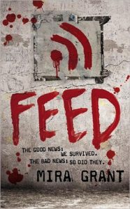
This year’s Hugo nominees boasted several good covers that appealed to me. The one I found most intriguing, from a creator’s standpoint, was Feed by Mira Grant.
Feed’s cover is not necessarily an intricate piece of artwork that I could spend hours staring at (A Hundred Thousand Kingdom’s cover is much better suited to that). But as a cover, I don’t know what more you could ask for. It’s so amazingly clever. Part of the cleverness stems from Grant’s genius in titling the book: if you don’t already know, Feed is a novel about a group of bloggers in a post–zombie apocalypse world. So it’s got zombies, who are always trying to feed, and bloggers, who want everyone to subscribe to their feed.
The cover captures this by focusing on only two elements: the title and the RSS feed icon painted in blood. The grungy gray wall in the background communicates the setting—semi–post-apocalyptic and definitely not pretty—and makes the word and icon etched in bright blood a high contrast. They pop, bringing the pun to the forefront. The blood and the grunge, when added to the word feed, evoke zombies in the minds of those in tune with the current cultural obsession with zombies. Adding the RSS icon gives a dash of the unexpected, and the pun becomes relatively sophisticated by virtue of being visual instead of vocal.
Because the cover taps into and combines two current cultural phenomena (zombies and blogs), it catches an audience’s eye and forces them to, at bare minimum, read the back cover to figure out what’s up. It achieves what a cover is meant to achieve: it gets people to want to know about the book. It makes readers stop for a moment before moving on to the next of their plethora of options. Feed stands out on the smorgasbord, and that’s the first thing a book needs when it is released into the market.
As far as the book goes, I greatly enjoyed Feed. It was a blast, and Mira Grant’s zombie-ridden world is detailed and exquisitely thought out. I loved that the zombies were not the story: they were a plot point but they were not the plot itself. Beautiful worldbuilding. My one gripe is that I could never quite believe that the main character had a reputation as a hard-fact news reporter. For a while I thought maybe the character could keep her strong opinions out of her writing, but the blog snippets that were at the end of each section never showed me that. So on that point, my disbelief never really got suspended, but it was a wonderful read in spite of that. It also has what is now one of my favorite sibling relationships in fiction. The main character and her brother are perfect.


Oh wow, I didn’t know the blogging part about the story. Very clever title… and I can see now why you like the cover so much.
Doesn’t it make you want to read it now? Can I just make it my personal mission to overload your to-read list?