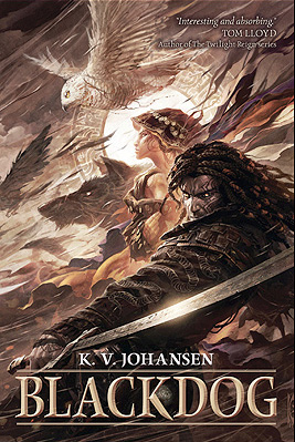
I haven’t analyzed a cover for a long time (not since Mira Grant’s Feed), but before the first month of 2012 passed I wanted to share with you my favorite covers from 2011 and why I think they work.* My top three are Blackdog by K.V. Johansen (illustration by Raymond Swanland), Embassytown by China Miéville (illustration and design by David Stevenson), and The Hum and the Shiver (photographs by Valentino Sani and Marilyn Angel Wynn). They all have excellent lines to draw the viewer’s eye and serve as compelling introductions to the stories inside.
Blackdog: A Study in Eye Movement
There are a lot of things I love about this cover, but all of it hinges on the spectacular illustration from Raymond Swanland. The color scheme is striking even though it isn’t flashy, because Swanland has a nice contrast between the lights and darks that adds flavor and variety without having to be extreme; the image packs a lot of elements in without feeling busy; Holla-Sayan (the guy in the foreground) is compelling.
But the thing that strikes me the most about this cover is the motion. Everything is moving. The owl is in a dive (as are the other shadowy birds), and that dive moves in the same direction as the ribbons of cloth coming from Attalissa (the girl in the center). The contrast of the bright circle in the center with all the darker elements draws your eye, but then it’s easy for your eye to flow around the rest of the cover elements following the motion lines. Then you get caught up in the intersection where Holla’s hand and his sword meet, you move up to his face, and you get hit head-on with the fact that he’s looking out from the cover. His face is the only element that isn’t synchronized with the upper-right–to–lower-left flow, and because of that it strikes a strong chord.
This cover is a study in the power of eye movement. The movement sucks you in, and the illustration has enough detail to keep you captivated for a while. Definitely long enough to decide you want to buy whatever is behind that cover. (As a nod to whoever did the text, the title color contrasts well with what’s behind it, but harmonizes with the existing illustration. It’s placement also defers to the illustration, which is smart considering how strong the illustration is.)
Embassytown: Room for Imagination
The first think I like about this cover is the color scheme. You can’t get more contrast than between black and white, and red is my favorite accent color. It’s a striking scheme that never seems to get old (for me, at least; I’m sure other people are sick to death of it).
David Stevenson uses the red judiciously: he only uses it for the author name, which is a lightweight font compared to the title typeface, so the red remains an accent, but not the note that stays with you. Where the Blackdog cover had a lot of diagonal motion, this cover is strictly top-to-bottom. The contrast of the black and red (or the black and white, depending on the viewer) draws your attention to the top. Then your eye filters down through the inverted pyramid of the jumbled letters and finally to the city, which is made up of vertical buildings.
The space between the title and the bottom of the cover is the part I like best about this cover. The jumbled letters give you an idea that words are important to the city below. It gives you hints; it gives you an impression of what Embassytown, the city, is like; it gives the city both a glow and a shadow. Those hints and impressions and contrasts are interesting, and they’re ripe for a viewer to start creating a story of their own with the image, a story that will compel them to read.
The Hum and the Shiver: Simple Can Sell
This cover is different than the other two because it relies on two images instead of on a specific illustration (if you’re a self-publisher thinking about a stock-photo cover, take note). Neither photo would make as compelling a cover alone. The landscape image is full of beautiful color. The yellows and oranges in the sky catch the eye, and they do so all the better because they’re bordered by the unobtrusive blue of the mountains below.
The shape of the mountains draws down in a V that guides the eye to the central figure (the other image). Like the city and the jumbled words of the Embassytown cover, this figure lets you, the viewer, start to tell yourself a story. Here is a woman, partially transparent, holding a stringed instrument. Because she’s nondescript—you can’t really see her face, you don’t know exactly what she’s feeling—you have the freedom to fill in the gaps.
This cover is simple: the contrasting colors draw your eye, and the solo, nondescript figure lets you tell yourself a story. It’s powerful from an emotional sense, and it sets a beautiful tone for the book inside.
______________________
*Remember, I’m not extensively skilled as a designer. I’m decent with typography and word-based design, but not stellar when it comes to creation. I leave the illustration and design to my more able colleagues. You don’t have to be able to create awesome stuff to love awesome stuff and to be able to say why.
