• Skip to main content
  • Skip to primary sidebar
  • Skip to footer

Looseleaf Editorial & Production

Book Editing & Design

  • Editing
    • Big-Picture Editing
    • Line Editing
    • Copyediting & Proofreading
  • Book Design
    • Book Layout
    • Ebook Formatting
    • Other Graphic Design
  • About
    • The Team
    • Our Work
    • Find Your Fit
    • Testimonials
  • Resources
    • Resources
    • Events
  • Blog
  • Contact

typography

Leaflet Review: Thief’s Covenant by Ari Marmell

February 21, 2012 by Kristy S. Gilbert 4 Comments

Thief's Covenant, Ari MarmellOnce she was Adrienne Satti, an orphan with a rags-to-riches story.

Now she is Widdershins, a thief with a sharp blade, a sharper wit, and help from a secret god living in her head.

But now something horrid, something dark, is reaching out for her, a past that refuses to let her go …

This is another book that was on my “books to look for in 2012” list. (It’s also on the list of books Lou Anders convinced me to buy with alarming ease. The guy’s a freaking hypnotist.) Before I start the review, I want to share a note about the cover. The image in this post and the cover on my book are different in one way that is significant to me: the apostrophe on my book is a curly quote, not a straight one. I can no longer tell if straight quotes bother me for true aesthetic reasons or because I’ve been trained to eradicate them, but they stab my soul one way or another. However, my scanner is rubbish, and all the online images I can find have the erroneous straight quote, so do me a favor and imagine the cover is typographically flawless, because the final product is.

Now I’ll review the actual text.

Renaissance Romp

This book has several things going for it. The plot races forward at a steady clip, seamlessly shifting from one plot arc to another. Although this is a YA book, Widdershins tackles adult issues—keeping food in her belly, balancing an investment portfolio, etc.—but she still keeps a youthful attitude and likeability. The book’s topics aren’t watered down for a younger audience either. For a novel labeled dark fantasy it’s on the light and friendly side of things, but it still fits comfortably in that sub-genre. The book also benefits from a fresher milieu than many secondary world fantasies: it is neither fully modern nor fully medieval, but takes root in a renaissance-style city called Davillon.

Although dark things happen in the book, it never stops being fun. Between Widdershins and Olgun, her personal god, nearly every page is filled with an element of sarcastic joy, despite the fact that at any given moment just about everything is going wrong. The characters make for good company, no matter the circumstances, which is not something I can say for every book I’ve read.

Some Quibbles

As with most books I review, I have a few quibbles. With Thief’s Covenant, most of them are on the prose level. Sometimes the humorous prose is overwrought, straining too hard for the laugh. Even so, there were plenty of times when it hit the sweet spot and I did laugh, and humor is more subjective than most things, so for some of you the jokes I find overwrought will hit you right on the funny bone.

There are also some more grammar- and usage-related issues: some rule-breaking that doesn’t seem to serve a purpose other than confusing me; some words (like miasma) that appear more frequently than they should (in my opinion); and some sentences I had to read multiple times to follow the action of a scene.

The good news: none of these issues stopped me from enjoying the story. It was fun, fast, and flavorful. I’ll be holding onto my copy, and the sequel, False Covenant, will most likely find its way onto my bookshelf. All minor quibbles aside, I can’t keep away from an upbeat character like Widdershins.

Cover illustration by Jason Chan.
Filed Under: Reviews Tagged With: Ari Marmell, fantasy, Lou Anders, Pyr, Thief's Covenant, typography, YA

Eye-Catchers: My Favorite Covers from 2011

January 30, 2012 by Kristy S. Gilbert 4 Comments

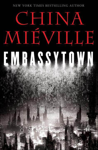
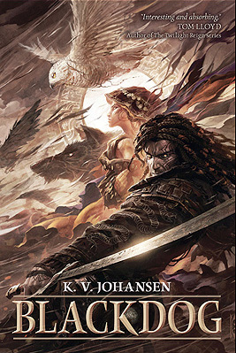
I haven’t analyzed a cover for a long time (not since Mira Grant’s Feed), but before the first month of 2012 passed I wanted to share with you my favorite covers from 2011 and why I think they work.* My top three are Blackdog by K.V. Johansen (illustration by Raymond Swanland), Embassytown by China Miéville (illustration and design by David Stevenson), and The Hum and the Shiver (photographs by Valentino Sani and Marilyn Angel Wynn). They all have excellent lines to draw the viewer’s eye and serve as compelling introductions to the stories inside.

Blackdog: A Study in Eye Movement

Blackdog by K. V. Johansen

There are a lot of things I love about this cover, but all of it hinges on the spectacular illustration from Raymond Swanland. The color scheme is striking even though it isn’t flashy, because Swanland has a nice contrast between the lights and darks that adds flavor and variety without having to be extreme; the image packs a lot of elements in without feeling busy; Holla-Sayan (the guy in the foreground) is compelling.

But the thing that strikes me the most about this cover is the motion. Everything is moving. The owl is in a dive (as are the other shadowy birds), and that dive moves in the same direction as the ribbons of cloth coming from Attalissa (the girl in the center). The contrast of the bright circle in the center with all the darker elements draws your eye, but then it’s easy for your eye to flow around the rest of the cover elements following the motion lines. Then you get caught up in the intersection where Holla’s hand and his sword meet, you move up to his face, and you get hit head-on with the fact that he’s looking out from the cover. His face is the only element that isn’t synchronized with the upper-right–to–lower-left flow, and because of that it strikes a strong chord.

This cover is a study in the power of eye movement. The movement sucks you in, and the illustration has enough detail to keep you captivated for a while. Definitely long enough to decide you want to buy whatever is behind that cover. (As a nod to whoever did the text, the title color contrasts well with what’s behind it, but harmonizes with the existing illustration. It’s placement also defers to the illustration, which is smart considering how strong the illustration is.)

Embassytown: Room for Imagination

Embassytown by China Miéville

The first think I like about this cover is the color scheme. You can’t get more contrast than between black and white, and red is my favorite accent color. It’s a striking scheme that never seems to get old (for me, at least; I’m sure other people are sick to death of it).

David Stevenson uses the red judiciously: he only uses it for the author name, which is a lightweight font compared to the title typeface, so the red remains an accent, but not the note that stays with you. Where the Blackdog cover had a lot of diagonal motion, this cover is strictly top-to-bottom. The contrast of the black and red (or the black and white, depending on the viewer) draws your attention to the top. Then your eye filters down through the inverted pyramid of the jumbled letters and finally to the city, which is made up of vertical buildings.

The space between the title and the bottom of the cover is the part I like best about this cover. The jumbled letters give you an idea that words are important to the city below. It gives you hints; it gives you an impression of what Embassytown, the city, is like; it gives the city both a glow and a shadow. Those hints and impressions and contrasts are interesting, and they’re ripe for a viewer to start creating a story of their own with the image, a story that will compel them to read.

The Hum and the Shiver: Simple Can Sell

The Hum and the Shiver by Alex Bledsoe

This cover is different than the other two because it relies on two images instead of on a specific illustration (if you’re a self-publisher thinking about a stock-photo cover, take note).  Neither photo would make as compelling a cover alone. The landscape image is full of beautiful color. The yellows and oranges in the sky catch the eye, and they do so all the better because they’re bordered by the unobtrusive blue of the mountains below.

The shape of the mountains draws down in a V that guides the eye to the central figure (the other image). Like the city and the jumbled words of the Embassytown cover, this figure lets you, the viewer, start to tell yourself a story. Here is a woman, partially transparent, holding a stringed instrument. Because she’s nondescript—you can’t really see her face, you don’t know exactly what she’s feeling—you have the freedom to fill in the gaps.

This cover is simple: the contrasting colors draw your eye, and the solo, nondescript figure lets you tell yourself a story. It’s powerful from an emotional sense, and it sets a beautiful tone for the book inside.

______________________

*Remember, I’m not extensively skilled as a designer. I’m decent with typography and word-based design, but not stellar when it comes to creation. I leave the illustration and design to my more able colleagues. You don’t have to be able to create awesome stuff to love awesome stuff and to be able to say why.

Filed Under: Publishing, Reviews Tagged With: Alex Bledsoe, Blackdog, China Miéville, cover design, covers, Davis Stevenson, design, Embassytown, K.V. Johansen, Raymond Swanland, The Hum and the Shiver, typography

Canto: The New Font from Font Bureau

October 31, 2011 by Kristy S. Gilbert Leave a Comment

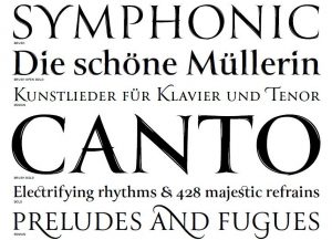
Canto Typeface SamplesAlthough I may not have enough knowledge to be considered a font nerd, I’m certainly a fan (I leave the nerding to other members of the Looseleaf team). Last week I got an email from Font Bureau announcing its newest font family: Canto, designed by Richard Lipton.

I’ve gotten a few announcements from Font Bureau since I joined its mailing list, but Canto is the first new release that really piques my interest.Check it out. Look at the PDF sample. Look at closeups of the different options. Elegant, fun stuff. I’d love to see the bold brush style on a book cover somewhere. The optional swashes (like the fancy N in and at the bottom of the snippet I show in this post) and optional ligatures give it a lot of diversity and plenty of options for titles. (Look at the Canto characters sheet to see what each character looks like and what the optional characters bring to the table.)

Canto is a bit like Trajan, which is probably a typeface more of you are familiar with, only it has more options and an organic touch.

For any of you who aren’t familiar with professional fonts, no, Canto is not free for download. Richard Lipton and the other folks at Font Bureau need to make a living too, and I’m sure this beauty took a good chunk of time and effort. It is available for purchase, and you can buy individual styles or the whole family. If you’re an indie author looking for a brand font, Canto wouldn’t be a bad option to look into.

Filed Under: Design Tagged With: Canto, Font Bureau, fonts, Richard Lipton, typefaces, typography

Weekly Roundup: 10/8–10/14

October 14, 2011 by Kristy S. Gilbert Leave a Comment

Kern Type ScreenshotKern Type: A Kerning Game

This may not appeal to many book people, but type nerds will appreciate this kerning game from Method of Action. From the game instructions: “Your mission is simple: achieve pleasant and readable text by distributing the space between letters. Typographers call this activity kerning. Your solution will be compared to [a] typographer’s solution, and you will be given a score depending on how close you nailed it. Good luck!”

Tony D’Souza: When to Stop Working on Your Book

Novelist Tony D’Souza describes all the work and years he put into his manuscript Voyage of the Rosa … and then explains how he let it go and started something else. Letting a book die is something many writers have a problem with. Having an objective eye to help you know when to let something lie is a huge benefit. Indie publishing means anything can be published, but not everything you write is something you should sell. D’Souza explains how his masterpiece became a monster; maybe his story can help you avoid similar pitfalls.

Amazon: Amazon Launches a New Imprint

Amazon is launching a new science fiction, fantasy, and horror imprint called 47North, and has announced the first run of titles.

Rose Fox: Someone at Amazon Launches a Speculative Fiction Imprint

In light of the 47North announcement, Rose Fox expresses concern that nobody seems to have stepped forward to claim the imprint from an editorial standpoint. She raises questions over whether or not the editorial side has much genre experience. She sounds a bit hostile (and she admits that she is), but she raises some good points regardless.

Stacy Whitman: FAQ: Muslim Protagonist

Editor Stacy Whitman of Tu Books answers a question from one of the writers submitting to her. The writer wonders if a Muslim protagonist isn’t relatable enough for a widespread audience. This writer really shouldn’t fear: he or she is submitting to Tu Books, which has the great goal of adding diversity into YA and middle grade science fiction and fantasy. In Stacy’s words: “When we say ‘about everyone, for everyone,’ we mean everyone. Except maybe Sauron.” In her post, Stacy focuses on what makes a character more or less relatable. Especially when you’re dealing with speculative fiction, that doesn’t mean your reader shares a background with the character.

Carolyn McCray: “Price Pulsing”

Over at Digital Book World, Carolyn McCray gives some Amazon-sales advice in her article, “‘Price Pulsing’: the Benefits of Dynamic Pricing on Amazon.” She describes a method of temporarily lowering your price for promotional purposes to boost you in the Amazon rankings before you put your book back at retail price. It’s essentially a sale, but McCray explains the strategy behind the sale.

Filed Under: Publishing Tagged With: 47North, Amazon, business of writing, Carolyn McCray, diversity, fantasy, horror, Kern Type, kerning, Muslim, pricing, Rose Fox, science fiction, speculative fiction, Stacy Whitman, Tony D'Souza, Tu Books, typography, weekly roundup, writing advice

Primary Sidebar

Hire Looseleaf

· Reserve a Fiction Manuscript Evaluation
· Other Editing Services
· Design Services
· Contact Looseleaf

Testimonials

Kristy is a joy and a pleasure to work with. She works quickly and efficiently with steep deadlines, and has an eye for detail that has helped me tremendously. … I highly recommend her.
Charlie N. Holmberg, Wall Street Journal bestselling author
Kristy’s talents and hard work on the book’s layout and design can be seen on every page.
Brandon Sanderson, NYT bestselling fantasy author
Through several iterations of my manuscript, Kristy has been relentless in showing me where pieces were in the wrong place, were starved for elaboration, or belonged in an entirely different puzzle. … I don’t want to imagine what my project would look like without her.
Ron Felt, literary fiction writer
Kristy took me through the formatting process with ease and assurance. I quickly trusted her and her opinions and knew that the end result would be a quality product. … She is talented, creative and professional in all aspects of her services.
Cynthia Anderson, nonfiction author
Kristy does a fantastic job every time. She’s punctual, thorough, affordable, and great to work with.
Brian McClellan, fantasy author
I have used Looseleaf for a number of projects, and have always been incredibly pleased by their speed, quality, and professionalism. … Phenomenal work, and I’ll definitely continue to use them for every project I can.
Dan Wells, New York Times bestseller
She really made my book shine by offering insightful and helpful feedback and catching more inconsistencies than I could have ever managed on my own.
Madison Custudio, contemporary romantic fantasy author

Newsletter signup

Please wait...

Thank you!

Footer

About Us

Looseleaf Editorial & Production was founded in 2011 with one goal: to help authors and publishers get their books ready for readers.

We specialize in top-notch editing and reader-focused design to help your story shine.

Let us help you next!

Contact Us

Our Work

This One’s For You by Kate Sweeney

This One’s For You by Kate Sweeney

Empire & Oracle

Empire & Oracle

Neom by Lavie Tidhar

Neom by Lavie Tidhar

Recent Articles

New Content Disclosures Policy

April 29, 2022 By Kristy S. Gilbert Leave a Comment

Meet the Looseleaf team: an image with three headshots in it.

Looseleaf Is Growing!

March 15, 2022 By Kristy S. Gilbert 1 Comment

LTUE 2022 Schedule

January 10, 2022 By Kristy S. Gilbert Leave a Comment

Copyright © 2025 · Looseleaf Editorial & Production · Log in