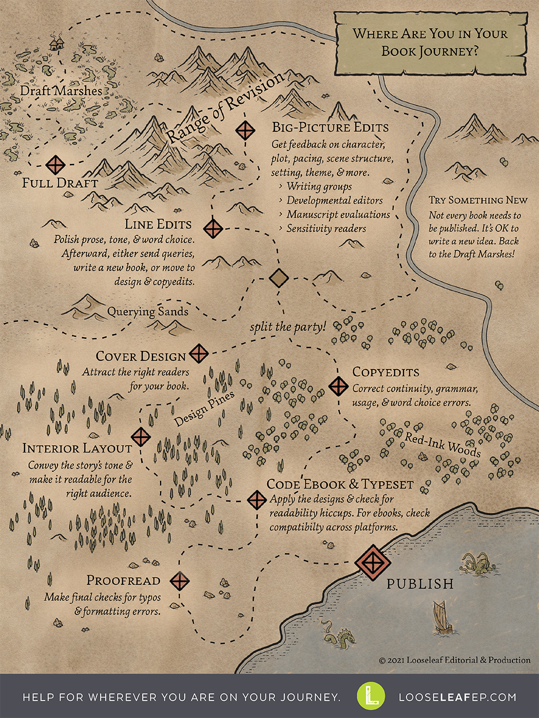
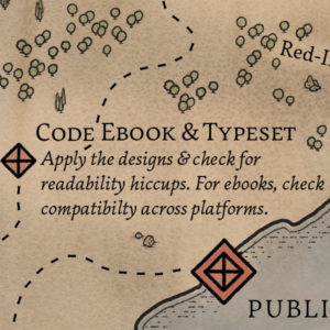
 It’s time to get the gang back together! Earlier in your book journey, you split the party to tackle initial design work and copyediting at the same time. Now you need to bring your polished text and your design tools together to create print-ready files and distribution-ready ebooks. This is where the Design Pines and the Red-Ink Woods meet. [Read more…] about Reunite the Party: Typesetting & Ebook Formatting
Design
The Design Pines
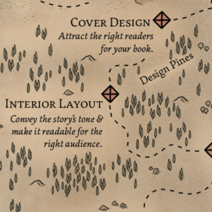 The Design Pines are a leg of the self-publishing book journey after line edits. This forest is where you gather materials and build tools to create the visual magic of your story. Unless you’re a skilled visual artist and graphic designer yourself, it’s wise to enlist one or more book designers. (If you’re publishing traditionally after a trip through the Querying Sands, your publisher will hire them.)
Because visual magic is usually less familiar to writers than wordy wonder is, this post is more detailed than the previous Book Journey Map explanations—and there are more free resources for more info at the end. [Read more…] about The Design Pines
Split Your Book Journey Party
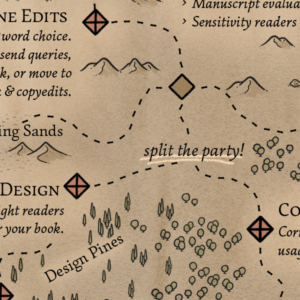 If you picked the self-publishing fork in the road after the Line Edit Foothills, it’s time to split your book journey party. You’ve got multiple quest objectives, and you can accomplish some of them at the same time if you plan it right. Right now you need to do two things: polish your manuscript and put together the graphic design pieces that make your book visually delightful. [Read more…] about Split Your Book Journey Party
Where Are You in Your Book Journey?
Especially if you’re new to the book-writing process, all the different types of editing and the steps for publication can be confusing. Now there’s a map for that! This map covers the main steps and phases for writing and self-publishing a book. (It also lets you know when to turn off to go the traditional publishing route via querying agents and publishers.) Once you know where you are in your process, it’s easier to get the help you need, whether from a writing group and critique partners or from professional editors and designers.
Book Design Templates & Tutorials
I’m passionate about creating beautiful books, and while a pitch-perfect cover makes for a great first impression, readers are going to spend the slow burn of a book with the interior book layout. I love creating a smooth reading flow, margins that give a story the right about of breathing room, and an immersive reader experience.
But as more authors turn to self-publishing to find their audience, more of them stumble into newbie formatting mistakes in their efforts to create really readable books. Many indie and hybrid authors are publishing quick-to-market books with streamlined budgets, and custom book design doesn’t always fit that modus operandi.
The Solution
So this summer, Looseleaf’s first-ever intern (Rachel Hulet) and I developed industry-standard, elegant book design templates to make reliable, reader-ready book design more affordable, accessible, and adaptable.
We made five templates tailored to specific genres and tones. Each one has everything you need for print and ebook interiors (plus bonus cover templates). The templates (along with tutorials and blog posts about book design techniques, software, and ebook considerations) are now all available at BestBookTemplates.com. More templates are on the way (probably one every 3-6 months), and I plan to post at least once a month with either new tips or a video analyzing a real book design by a different designer.
The Templates
Custom book interiors are still very important here at Looseleaf, but if it’s outside your budget, consider either a DIY template or a template + typesetting assistance to get your book reader ready.
Scáthach (Fantasy)
Scáthach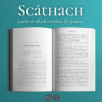 is designed for fantasy novels and novellas. Everything is tailored for a high fantasy feel, and the kit has specialty text options to support all the immersive elements of your story. It includes options to put epigraphs at the start of chapters, an elegant unicase font for all the titles, and easy-to-use styling for letters and blockquotes, poetry, and more.
Joyce (Literary & Memoir)
Joyce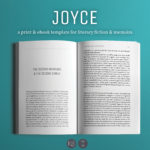 is designed specifically for character-driven narratives with strong themes. It features simple but striking horizontal lines to set off chapter starts, scene breaks, and section/part dividers, and the body text feels at once both classic and contemporary. It’s particularly genre-fluid so long as the book at hand trends more literary. So far, Joyce is the most popular template in the stable.
Enceladus (Science Fiction)
Enceladus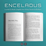 sits on a design boundary that makes it a good fit for both tech-heavy science fiction and techno-thrillers. It includes special text styles not only for the usual letters and poems but also for computer code and other digital comms. Chapter starts have options to include (or not) timestamps that are common in thrillers in which knowing the time and place is essential and space operas that span various planets and solar systems.
Meet Cute (Contemporary Romance)
Meet Cute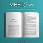 is one of two romance-genre templates we have right now. It works best for books with electrifying first meetings and beautifully complementary characters, and it has specialty text options to support all the details of a modern-day happily ever after. (And if you employ one of the options that doesn’t use the cursive font, it can be a solid choice for other contemporary fiction!)
Dashwood (Historical Romance)
Dashwood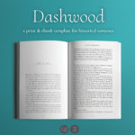 is the second romance template, and it’s tailored for an elegant, period-piece experience. It also includes options for time and location stamps for books that really dig into their time-and-place research.
The Training
BestBookTemplates.com is also where all my future articles about book design will post first, but I’ll post a quarterly digest of all the articles and videos here on LooseleafEP.com.
Font Licensing for Ebooks. If you’re particular about type design, ebooks can present special challenges because font licensing for ebooks is different (and usually more expensive) than licensing for print book design.
Book Design in the Wild: The Phlebotomist. There are many places to find book design ideals—design textbooks and blog posts seem happy to provide rules and regulations for creating the perfect book layout. But in my own study, I found that pages set up using the golden ratio and perfectly harmonious margins were hardly the norm, even when the book design worked well for the project and its audience. So I started making videos about real books with real-life constraints and solutions.
New: Comic Book Ebook Design for Kindle
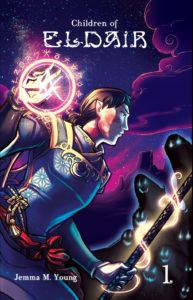 Looseleaf now offers comic book ebook design for Kindle! The first two projects we’ve helped produce are Book 1 and Book 2 of Children of Eldair, a full-color portal fantasy comic by Jemma M. Young. (Looseleaf also copyedited and proofread Book 2.) You can buy both the ebooks and the gorgeously printed paperbacks on Amazon (Book 1 is available now; Book 2 is forthcoming), and when you’ve finished those off, you can see the latest pages on a regular basis at Eldair.com.
File Formats for Comic Book Ebook Design
Ebooks aren’t usually the first option for comics. Most ebooks are reflowable, which means the text can shift around to let readers adjust the size and other aspects to suit their reading choices. Comics, with their rich, dense illustration and specifically placed text, don’t do well in a reflowable book. But if you want to publish a portable, electronic version of your ebook, don’t settle for a static PDF. The Kindle format is your best bet. Amazon has created a platform that readily integrates panel magnification in a way that keeps file sizes low while making it easy for readers to zoom in on intricate artwork, dialogue text, and more. EPUB format (which Nooks, iBooks, Kobo devices, and more use) can do similar things, but the code is more complex, and the files can become large, especially with detailed or lush artwork (like Jemma’s work with Children of Eldair). EPUB files need to be compatible with many different platforms and devices, while Kindle files wrangle only with different devices.
But even with a ready-to-run format, the time spent building an ebook is time you aren’t writing, drawing, inking, lettering, and/or coloring your comic. If you want a Kindle-ready version of your comic, trust Looseleaf with your story. We’ll get it reader ready. Need more information? Get a quote on your comic book ebook design.
Not a comic book writer? We’ve got you covered with standard print and ebook design pricing.
What Is Typesetting?
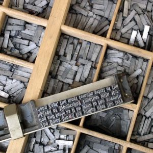 I used to introduce myself as a book editor and typesetter, and people often asked me: What is typesetting? Though I now introduce myself as a book editor and designer, I’ve practiced delivering a simple answer.
Typesetting is the process of composing a text using fonts, sizes, line spacing, and other details that make it appropriate for a given audience and purpose. Professional typesetters pay particular attention to readability and strive to eliminate line breaks, paragraph breaks, hyphenation issues, and other typographic elements that can distract from the reading experience or impede a reader’s understanding.
Some professional definitions of typesetting include only the interior book design—selecting the fonts and styling to package your story—or finessing your book into a smooth ride for your reader. Here at Looseleaf, we do both, because one without the other is a little lame, and your book should never be lame. Below are some of the wrinkles Looseleaf irons out in a print layout after making the important design decisions for your book. [Read more…] about What Is Typesetting?
Looseleaf Word Nerd T-shirts Launched
I work with storytellers and writers . . . which normally means they’re avid readers too. Last month I put together two t-shirts for my word nerd friends and writerly clients, and today the initial designs launch!
 The first shirt is one I’m particularly proud of. It says, “I’m not a grammar Nazi: I’m Captain American English.” Because when I nitpick over your comma placement, I’d rather see myself as heroic rather than neurotic. The stories we tell ourselves matter, folks.
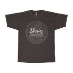 The second shirt is a constellation star chart (northern hemisphere, Greek & Western constellations) and words celebrating story. Cultures worldwide have tamed the stars with constellations and stories, claiming the distant stars as their own. Storytellers of all stripes—writers, artists, parents of small children—create new ways of seeing our wild universe. They give us narrative maps to navigate by, guidebooks to exploring and expanding ourselves. Our stories have the power to tame the untambeable.
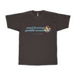 The third shirt is the first in what I hope will become a series of shirts spotlighting particularly powerful poetry. I’m leading off with the estimable E. E. Cummings and my favorite phrases from his poem “In Just-.” The poem is equal parts poignant and playful, but in lifting only the springtime descriptors mud-luscious and puddle-wonderful, I focus on the splish-splash joy of April showers.
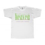 Joining the E. E. Cummings shirt is another watercolor poetry tee with a quote from Elizabeth Barrett Browning. It’s perfect for hiking or walking through the everyday divine of nature: “Earth’s crammed with heaven, / And every common bush afire with God.”
All shirts come in both unisex and women-specific styles.
