• Skip to main content
  • Skip to primary sidebar
  • Skip to footer

Looseleaf Editorial & Production

Book Editing & Design

  • Editing
    • Big-Picture Editing
    • Line Editing
    • Copyediting & Proofreading
  • Book Design
    • Book Layout
    • Ebook Formatting
    • Other Graphic Design
  • About
    • The Team
    • Our Work
    • Find Your Fit
    • Testimonials
  • Resources
    • Resources
    • Events
  • Blog
  • Contact

design

Looseleaf Word Nerd T-shirts Launched

July 10, 2017 by Kristy S. Gilbert Leave a Comment

I work with storytellers and writers . . . which normally means they’re avid readers too. Last month I put together two t-shirts for my word nerd friends and writerly clients, and today the initial designs launch!

A navy-blue T-shirt with white text that says, "I'm not a grammar Nazi: I'm Captain American English."
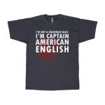
The first shirt is one I’m particularly proud of. It says, “I’m not a grammar Nazi: I’m Captain American English.” Because when I nitpick over your comma placement, I’d rather see myself as heroic rather than neurotic. The stories we tell ourselves matter, folks.

A black T-shirt decorated with a constellation star chart and the words "Stories tame the stars and make them ours."
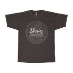
The second shirt is a constellation star chart (northern hemisphere, Greek & Western constellations) and words celebrating story. Cultures worldwide have tamed the stars with constellations and stories, claiming the distant stars as their own. Storytellers of all stripes—writers, artists, parents of small children—create new ways of seeing our wild universe. They give us narrative maps to navigate by, guidebooks to exploring and expanding ourselves. Our stories have the power to tame the untambeable.

A dark gray T-shirt decorated with the words "mud-luscious & puddle-wonderful" in blue and orange text.
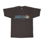
The third shirt is the first in what I hope will become a series of shirts spotlighting particularly powerful poetry. I’m leading off with the estimable E. E. Cummings and my favorite phrases from his poem “In Just-.” The poem is equal parts poignant and playful, but in lifting only the springtime descriptors mud-luscious and puddle-wonderful, I focus on the splish-splash joy of April showers.

A white T-shirt decorated with the words "Earth's crammed with heaven, And every common bush afire with God."
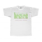
Joining the E. E. Cummings shirt is another watercolor poetry tee with a quote from Elizabeth Barrett Browning. It’s perfect for hiking or walking through the everyday divine of nature: “Earth’s crammed with heaven, / And every common bush afire with God.”

All shirts come in both unisex and women-specific styles.


Filed Under: Design Tagged With: constellations, design, e e cummings, poetry, storytelling, swag, t-shirts, word nerd

Eye-Catchers: My Favorite Covers from 2011

January 30, 2012 by Kristy S. Gilbert 4 Comments

I haven’t analyzed a cover for a long time (not since Mira Grant’s Feed), but before the first month of 2012 passed I wanted to share with you my favorite covers from 2011 and why I think they work.* My top three are Blackdog by K.V. Johansen (illustration by Raymond Swanland), Embassytown by China Miéville (illustration and design by David Stevenson), and The Hum and the Shiver (photographs by Valentino Sani and Marilyn Angel Wynn). They all have excellent lines to draw the viewer’s eye and serve as compelling introductions to the stories inside.

Blackdog: A Study in Eye Movement

Blackdog by K. V. Johansen

There are a lot of things I love about this cover, but all of it hinges on the spectacular illustration from Raymond Swanland. The color scheme is striking even though it isn’t flashy, because Swanland has a nice contrast between the lights and darks that adds flavor and variety without having to be extreme; the image packs a lot of elements in without feeling busy; Holla-Sayan (the guy in the foreground) is compelling.

But the thing that strikes me the most about this cover is the motion. Everything is moving. The owl is in a dive (as are the other shadowy birds), and that dive moves in the same direction as the ribbons of cloth coming from Attalissa (the girl in the center). The contrast of the bright circle in the center with all the darker elements draws your eye, but then it’s easy for your eye to flow around the rest of the cover elements following the motion lines. Then you get caught up in the intersection where Holla’s hand and his sword meet, you move up to his face, and you get hit head-on with the fact that he’s looking out from the cover. His face is the only element that isn’t synchronized with the upper-right–to–lower-left flow, and because of that it strikes a strong chord.

This cover is a study in the power of eye movement. The movement sucks you in, and the illustration has enough detail to keep you captivated for a while. Definitely long enough to decide you want to buy whatever is behind that cover. (As a nod to whoever did the text, the title color contrasts well with what’s behind it, but harmonizes with the existing illustration. It’s placement also defers to the illustration, which is smart considering how strong the illustration is.)

Embassytown: Room for Imagination

Embassytown by China Miéville

The first think I like about this cover is the color scheme. You can’t get more contrast than between black and white, and red is my favorite accent color. It’s a striking scheme that never seems to get old (for me, at least; I’m sure other people are sick to death of it).

David Stevenson uses the red judiciously: he only uses it for the author name, which is a lightweight font compared to the title typeface, so the red remains an accent, but not the note that stays with you. Where the Blackdog cover had a lot of diagonal motion, this cover is strictly top-to-bottom. The contrast of the black and red (or the black and white, depending on the viewer) draws your attention to the top. Then your eye filters down through the inverted pyramid of the jumbled letters and finally to the city, which is made up of vertical buildings.

The space between the title and the bottom of the cover is the part I like best about this cover. The jumbled letters give you an idea that words are important to the city below. It gives you hints; it gives you an impression of what Embassytown, the city, is like; it gives the city both a glow and a shadow. Those hints and impressions and contrasts are interesting, and they’re ripe for a viewer to start creating a story of their own with the image, a story that will compel them to read.

The Hum and the Shiver: Simple Can Sell

The Hum and the Shiver by Alex Bledsoe

This cover is different than the other two because it relies on two images instead of on a specific illustration (if you’re a self-publisher thinking about a stock-photo cover, take note).  Neither photo would make as compelling a cover alone. The landscape image is full of beautiful color. The yellows and oranges in the sky catch the eye, and they do so all the better because they’re bordered by the unobtrusive blue of the mountains below.

The shape of the mountains draws down in a V that guides the eye to the central figure (the other image). Like the city and the jumbled words of the Embassytown cover, this figure lets you, the viewer, start to tell yourself a story. Here is a woman, partially transparent, holding a stringed instrument. Because she’s nondescript—you can’t really see her face, you don’t know exactly what she’s feeling—you have the freedom to fill in the gaps.

This cover is simple: the contrasting colors draw your eye, and the solo, nondescript figure lets you tell yourself a story. It’s powerful from an emotional sense, and it sets a beautiful tone for the book inside.

______________________

*Remember, I’m not extensively skilled as a designer. I’m decent with typography and word-based design, but not stellar when it comes to creation. I leave the illustration and design to my more able colleagues. You don’t have to be able to create awesome stuff to love awesome stuff and to be able to say why.

Filed Under: Publishing, Reviews Tagged With: Alex Bledsoe, Blackdog, China Miéville, cover design, covers, Davis Stevenson, design, Embassytown, K.V. Johansen, Raymond Swanland, The Hum and the Shiver, typography

Weekly Roundup: 10/15–10/21

October 21, 2011 by Kristy S. Gilbert Leave a Comment

Page from the Book of KellsChristopher Butler: How Disregarding Design Limits The Power Of Content

This is a pretty long article from Christopher Butler that talks about how design can shape and inform meaning and interpretation. It’s especially relevant today when design is so fluid—ebooks change from device to device, etc. Butler points out that the problems with fluid form aren’t problematic for everything, but fluid form does present limits that are problematic in some instances.

Kevin Canfield: Can Harper Perennial Reinvent Publishing?

In this article Kevin Canfield examines how Harper Perennial is staying nimble and relevant in today’s publishing climate. It’s a good look at how publishers can adapt to the opportunities available today.

New York Times: Authors to Get Sales Data Online From 3 Big Publishers

The New York Times reports that three big publishers are implementing online access to sales data that they will release to their authors. This is a great change, in my opinion. Authors have been a bit starved for information in many situations—that’s one of the appeals of epublishing. Changing that discrepancy will strengthen publishers’ positions in the market.

Duolit: Get Noticed: 5 Steps to Boosting Book Publicity

The team over at Duolit gives out five key points for publicizing your book. Their tips help you look professional and prepared. Another piece of their advice—having your publicity plan figured out before you publish—is key to publicizing your books properly.

Writing Excuses: Endings

Writers often get a lot of advice about starting out and beginning, but advice on endings is a little harder to come by. Lou Anders returns to Writing Excuses to discuss sticking your novel’s ending.

Filed Under: Publishing Tagged With: big publishers, Christopher Butler, design, Duolit, ebook design, Harper Perennial, Kevin Canfield, Lou Anders, New York Times, publicity, sales, sales data, Writing Excuses

Minimalist Design for Children’s Stories

September 7, 2011 by Kristy S. Gilbert Leave a Comment

Little Red Riding Hood by Christian JacksonI recently discovered a series of minimalist posters inspired by various children’s stories and designed by Christian Jackson (I didn’t find them by myself; they were in an article on Flavorwire). My favorites among them are Little Red Riding Hood, Rumpelstiltskin, and a toss up between The message of the one duckling that’s different is delightful, but The Pied Piper poster was, I thought, one of the most interesting interpretations of the story because there is so much focus on the death involved; for me The Pied Piper had always been about very personal loss, but not necessarily death, so that was a different take for me (not that I minded; I always love a different take on a folktale).

What interests me (perhaps) most about these posters is how well the minimalism works for the folktales (yes, many of the stories he did technically have named authors, instead of the nebulous “folk,” but they’ve become so pervasive in our culture that they pretty much even out to the same thing). Because these stories are so ingrained and so common, we don’t need much prompting to retell the stories to ourselves. We only need motifs, hints, and light touches to evoke an entire lifetime of stories and retellings. Take the Little Red Riding Hood poster, for example. All you really need to evoke the story is the red cape in the woods; adding the edges of a wolf’s paw adds a tone of menace, but isn’t necessary for you to know exactly what Jackson is getting at.

Think about that for a second: All you need, visually, is three dark fingers and you can imagine the wolf it belongs to, and all the nasty things that wolf will eventually do (depending on which version of the story is nearest and dearest to your heart, those nasty things may be more or less than what I imagine).

Folktales are powerful because they are so common, and because “everyone” knows them. You can use them to enhance, contrast with, or influence anything you’re doing and you’ll be able to strike a chord with your audience. They’re an effective tool in any creators toolbox, whether you are an artist, writer, or any sort of communicator. Stories communicate, and stories you don’t even have to tell people communicate efficiently.

Filed Under: Design, Publishing Tagged With: design, fairy tales, folktales, illustration

Primary Sidebar

Hire Looseleaf

· Reserve a Fiction Manuscript Evaluation
· Other Editing Services
· Design Services
· Contact Looseleaf

Testimonials

I have used Looseleaf for a number of projects, and have always been incredibly pleased by their speed, quality, and professionalism. … Phenomenal work, and I’ll definitely continue to use them for every project I can.
Dan Wells, New York Times bestseller
Kristy took me through the formatting process with ease and assurance. I quickly trusted her and her opinions and knew that the end result would be a quality product. … She is talented, creative and professional in all aspects of her services.
Cynthia Anderson, nonfiction author
Through several iterations of my manuscript, Kristy has been relentless in showing me where pieces were in the wrong place, were starved for elaboration, or belonged in an entirely different puzzle. … I don’t want to imagine what my project would look like without her.
Ron Felt, literary fiction writer
Kristy does a fantastic job every time. She’s punctual, thorough, affordable, and great to work with.
Brian McClellan, fantasy author
Kristy is a joy and a pleasure to work with. She works quickly and efficiently with steep deadlines, and has an eye for detail that has helped me tremendously. … I highly recommend her.
Charlie N. Holmberg, Wall Street Journal bestselling author
She really made my book shine by offering insightful and helpful feedback and catching more inconsistencies than I could have ever managed on my own.
Madison Custudio, contemporary romantic fantasy author
Kristy’s talents and hard work on the book’s layout and design can be seen on every page.
Brandon Sanderson, NYT bestselling fantasy author

Newsletter signup

Please wait...

Thank you!

Footer

About Us

Looseleaf Editorial & Production was founded in 2011 with one goal: to help authors and publishers get their books ready for readers.

We specialize in top-notch editing and reader-focused design to help your story shine.

Let us help you next!

Contact Us

Our Work

This One’s For You by Kate Sweeney

This One’s For You by Kate Sweeney

Empire & Oracle

Empire & Oracle

Neom by Lavie Tidhar

Neom by Lavie Tidhar

Recent Articles

New Content Disclosures Policy

April 29, 2022 By Kristy S. Gilbert Leave a Comment

Meet the Looseleaf team: an image with three headshots in it.

Looseleaf Is Growing!

March 15, 2022 By Kristy S. Gilbert 1 Comment

LTUE 2022 Schedule

January 10, 2022 By Kristy S. Gilbert Leave a Comment

Copyright © 2025 · Looseleaf Editorial & Production · Log in