• Skip to main content
  • Skip to primary sidebar
  • Skip to footer

Looseleaf Editorial & Production

Book Editing & Design

  • Editing
    • Big-Picture Editing
    • Line Editing
    • Copyediting & Proofreading
  • Book Design
    • Book Layout
    • Ebook Formatting
    • Other Graphic Design
  • About
    • The Team
    • Our Work
    • Find Your Fit
    • Testimonials
  • Resources
    • Resources
    • Events
  • Blog
  • Contact

cover design

The Design Pines

March 15, 2021 by Kristy S. Gilbert 5 Comments

Map of the Design Pines, which contain cover design (which you use to attract the right readers for your book) and interior layout (which you use to convey the story's tone & make it readable for the right audience).
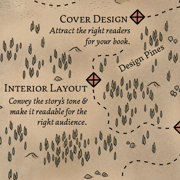
The Design Pines are a leg of the self-publishing book journey after line edits. This forest is where you gather materials and build tools to create the visual magic of your story. Unless you’re a skilled visual artist and graphic designer yourself, it’s wise to enlist one or more book designers. (If you’re publishing traditionally after a trip through the Querying Sands, your publisher will hire them.)

Because visual magic is usually less familiar to writers than wordy wonder is, this post is more detailed than the previous Book Journey Map explanations—and there are more free resources for more info at the end. [Read more…] about The Design Pines

Filed Under: Design, Fiction Tagged With: book design, Book Journey Map, cover design

Promotional Posters for Followed by Frost

December 11, 2015 by Kristy S. Gilbert Leave a Comment

Earlier this year Charlie N. Holmberg asked me to put together some promotional pieces she could use prior to the release of her fourth novel, Followed by Frost. For these, she picked out a series of photos from iStockphoto and gave me a list of significant quotes from the book. From there, I paired the best quotes with the best images and combined them. Some of the images needed some minimal manipulation to better match the book, and each piece needed to be in both rectangular and square formats so it could be used well in different social media outlets.

I loved working on these—they were a fun project that got immediate use promoting a delightful novel.

winter-friend

winter-friend_sq

never-warm-again_2

never-warm-again_2_sq

beautiful-kindness

beautiful-kindness_sq

almost

almost_sq

Filed Under: Design, Looseleaf Tagged With: Charlie N. Holmberg, cover design, promotional materials

New Project: The Folklore Historian, Volume 29

December 13, 2013 by Kristy S. Gilbert Leave a Comment

My most recently completed editorial project isn’t technically a Looseleaf project—I’m the temporary managing editor for this one, not a freelancer, exactly—but I wanted to share it anyway. The last project was a novel, but this one was a scholarly journal focusing historical approaches to folklore (or folklore in a historical perspective). I present volume 29 of The Folklore Historian, a member of the American Folklore Society’s family of publications.

Cover of The Folklore Historian, volume 29

I didn’t do all the work on this issue. I took over at the beginning of the semester, so I proofread the final text, managed final revisions with the authors, laid the journal out in InDesign, designed the cover, and took the files to and checked the proofs from the press.

Filed Under: Looseleaf Tagged With: clients, cover design, folklore, Looseleaf, proofreading, The Folklore Historian, typesetting

Eye-Catchers: My Favorite Covers from 2011

January 30, 2012 by Kristy S. Gilbert 4 Comments

I haven’t analyzed a cover for a long time (not since Mira Grant’s Feed), but before the first month of 2012 passed I wanted to share with you my favorite covers from 2011 and why I think they work.* My top three are Blackdog by K.V. Johansen (illustration by Raymond Swanland), Embassytown by China Miéville (illustration and design by David Stevenson), and The Hum and the Shiver (photographs by Valentino Sani and Marilyn Angel Wynn). They all have excellent lines to draw the viewer’s eye and serve as compelling introductions to the stories inside.

Blackdog: A Study in Eye Movement

Blackdog by K. V. Johansen

There are a lot of things I love about this cover, but all of it hinges on the spectacular illustration from Raymond Swanland. The color scheme is striking even though it isn’t flashy, because Swanland has a nice contrast between the lights and darks that adds flavor and variety without having to be extreme; the image packs a lot of elements in without feeling busy; Holla-Sayan (the guy in the foreground) is compelling.

But the thing that strikes me the most about this cover is the motion. Everything is moving. The owl is in a dive (as are the other shadowy birds), and that dive moves in the same direction as the ribbons of cloth coming from Attalissa (the girl in the center). The contrast of the bright circle in the center with all the darker elements draws your eye, but then it’s easy for your eye to flow around the rest of the cover elements following the motion lines. Then you get caught up in the intersection where Holla’s hand and his sword meet, you move up to his face, and you get hit head-on with the fact that he’s looking out from the cover. His face is the only element that isn’t synchronized with the upper-right–to–lower-left flow, and because of that it strikes a strong chord.

This cover is a study in the power of eye movement. The movement sucks you in, and the illustration has enough detail to keep you captivated for a while. Definitely long enough to decide you want to buy whatever is behind that cover. (As a nod to whoever did the text, the title color contrasts well with what’s behind it, but harmonizes with the existing illustration. It’s placement also defers to the illustration, which is smart considering how strong the illustration is.)

Embassytown: Room for Imagination

Embassytown by China Miéville

The first think I like about this cover is the color scheme. You can’t get more contrast than between black and white, and red is my favorite accent color. It’s a striking scheme that never seems to get old (for me, at least; I’m sure other people are sick to death of it).

David Stevenson uses the red judiciously: he only uses it for the author name, which is a lightweight font compared to the title typeface, so the red remains an accent, but not the note that stays with you. Where the Blackdog cover had a lot of diagonal motion, this cover is strictly top-to-bottom. The contrast of the black and red (or the black and white, depending on the viewer) draws your attention to the top. Then your eye filters down through the inverted pyramid of the jumbled letters and finally to the city, which is made up of vertical buildings.

The space between the title and the bottom of the cover is the part I like best about this cover. The jumbled letters give you an idea that words are important to the city below. It gives you hints; it gives you an impression of what Embassytown, the city, is like; it gives the city both a glow and a shadow. Those hints and impressions and contrasts are interesting, and they’re ripe for a viewer to start creating a story of their own with the image, a story that will compel them to read.

The Hum and the Shiver: Simple Can Sell

The Hum and the Shiver by Alex Bledsoe

This cover is different than the other two because it relies on two images instead of on a specific illustration (if you’re a self-publisher thinking about a stock-photo cover, take note).  Neither photo would make as compelling a cover alone. The landscape image is full of beautiful color. The yellows and oranges in the sky catch the eye, and they do so all the better because they’re bordered by the unobtrusive blue of the mountains below.

The shape of the mountains draws down in a V that guides the eye to the central figure (the other image). Like the city and the jumbled words of the Embassytown cover, this figure lets you, the viewer, start to tell yourself a story. Here is a woman, partially transparent, holding a stringed instrument. Because she’s nondescript—you can’t really see her face, you don’t know exactly what she’s feeling—you have the freedom to fill in the gaps.

This cover is simple: the contrasting colors draw your eye, and the solo, nondescript figure lets you tell yourself a story. It’s powerful from an emotional sense, and it sets a beautiful tone for the book inside.

______________________

*Remember, I’m not extensively skilled as a designer. I’m decent with typography and word-based design, but not stellar when it comes to creation. I leave the illustration and design to my more able colleagues. You don’t have to be able to create awesome stuff to love awesome stuff and to be able to say why.

Filed Under: Publishing, Reviews Tagged With: Alex Bledsoe, Blackdog, China Miéville, cover design, covers, Davis Stevenson, design, Embassytown, K.V. Johansen, Raymond Swanland, The Hum and the Shiver, typography

Leaflet Review: Embassytown by China Miéville

December 7, 2011 by Kristy S. Gilbert 2 Comments

Embassytown by China MiévilleIn the far future, humans have colonized a distant planet, home to the enigmatic Ariekei, sentient beings famed for a language unique in the universe, one that only a few altered human ambassadors can speak.

Avice Benner Cho, a human colonist, has returned to Embassytown after years of deep-space adventure. She cannot speak the Ariekei tongue, but she is an indelible part of it, having long ago been made a figure of speech, a living simile in their language.

When distant political machinations deliver a new ambassador to Arieka, the fragile equilibrium between humans and aliens is violently upset. Catastrophe looms, and Avice is torn between competing loyalties: to a husband she no longer loves, to a system she no longer believes in, and to her place in a language which speaks through her, whether she likes it or not.

First, check out that cover. Isn’t it awesome? Maybe it’s my recent obsession with black-white-red color schemes, but I love it.

China Miéville is known for bending things: definitions, genres, minds. His latest novel, Embassytown, follows that vein. It’s a science fiction novel, a mystery, a thought experiment. It’s a book that, at one point, I thought of as the Opium Wars in Space, except it’s not like the Opium Wars at all.

What drew me to the book was the idea that it’s all about language: the Embassytown colonists and their Ariekei Hosts speak very different languages. The Hosts have two mouths that speak in tandem, but simply emitting simultaneous sounds is not enough to speak their language: machines cannot speak it; they cannot write; they have no word for “that.” Hosts can only speak the truth, because their language is truth, and they only hear Language when there is a soul behind the sounds. They need humans to act out events so they can construct similes; for this to be like that, that must have actually happened. Avice Benner Cho, the main character, is the girl who was hurt in the dark and ate what was given her, and the Hosts use her simile all the time.

So that’s what intrigued me. What really impressed me was Avice’s growth. This is a character who is very different at the end of the book than she is at the beginning, and yet her growth is so masterfully done, so natural to her surroundings, that it never felt like a character arc. It felt like someone maturing to meet her circumstances; it felt real.

I’m not normally in for alien-world science fiction. Those books normally get too weird for me, to be honest. (Even in Embassytown it still gets weird, and I have absolutely no idea what a Host looks like. I ended up just imagining them like praying mantises and adding eye stalks and other bits when the narration called for them—then I’d go back to my praying mantis model.) But Embassytown kept me interested and engaged. It may have been that there was a lot of linguistics in it (mostly from Avice’s husband, who is a linguist) and I was able to recall the linguistics I studied in college. That probably helped. But Avice kept me rapt. I devoured this book. I thought about it for days afterward (I’m still thinking about it).

The book jacket copy and the Library of Congress information for Embassytown make loyalty out to be one of the main themes of the novel. I didn’t get much of that vibe. Sure, there are little loyalty battles in there, but I didn’t come away from the book aching about loyalty. The ache that I came away with was the idea that change has to happen, progress has to be made, but sometimes what you leave behind is just as valuable as what you’re moving towards. Sometimes you have to leave things behind out of necessity, and what you leave them for may be better in some ways, worse in others, but it’s what you need. And that’s a little sad. Bittersweet enough to make me ache.

I guess that’s probably too hard to fit in Library of Congress filing information. Basically, this book is wonderful. I’ll likely reread it. I feel like I shortchanged everyone involved in its creation because I got it 50% off at the Borders liquidation. And when it comes time to nominate books for the Hugos, this one’s going to be on my mind.

Content warnings: Language, mature themes, sci-fi violence.

Filed Under: Reviews Tagged With: book review, character, China Miéville, cover design, Del Rey, science fiction

Weekly Roundup: 9/24–9/30

September 30, 2011 by Kristy S. Gilbert 1 Comment

Gini Dietrich: Control Your Own Destiny

Gini is not in publishing, per se (though she is writing a book). Gini is in PR, and she’s also a business owner and she’s not keen on blaming your shortcomings on the “current climate.” While reading her article, the arguments she was refuting reminded me of common complaints about the publishing industry. She says, “Stop blaming the economy and start working twice as hard to build [y]our businesses”; I hear, “Stop blaming the industry and start working twice as hard on your writing.” Write great sentences; write great chapters; write great books. If you get a pile of rejection letters or your self-published novel tanks, don’t blame your circumstances. Brush yourself off and do it all again, only better. Books are you business. Don’t fall into this human flaw Gini points out: “We’re human beings. We like to have someone/something to blame when things don’t go our way. We’re inherently lazy. And we are always looking for shortcuts and the easy way out.”

(Reading Gini’s blog, Spin Sucks, can also be very informative when it comes to marketing, especially authentic marketing like that championed by a lot of publishing pros. I read it every day, and while I don’t always find something relevant to me, I find relevant posts often enough that I keep reading.)

TABISSO Punctuation LampsTABISSO: Punctuation Lamps

I want one of these lamps. The closing quotation marks are beautiful, but depending on where it was going I might pick the colon instead, because I love colons. (By the way, last Saturday was National Punctuation Day, and I intended to entertain you with a lovely post about the dash family—hyphen, en dash, and em dash—but I was celebrating the first wedding anniversary I’ve spent in the same country as my husband, so I never wrote the post. I’ll write one for you later, because I believe they grant you amazing options for communication and nuance.)

Amazon: The Kindle Fire & Cheaper Kindle Models

You’ve probably already heard about Amazon’s Kindle Fire, the $199 color tablet that was announced this week. My thoughts? If I’m getting an ereader, I want e-ink. I personally don’t like backlighting at all. If I’m going to get a tablet, I would probably go with something other than the Kindle Fire. Currently it appears that Amazon is trying to exert the kind of control over its appstore that Apple has over iTunes, but their submission process has been complicated, flawed, and unhelpful for the app company I work for. Apps get rejected before they’re reviewed and then the company gets reminders to resubmit the app—even though the app is already resubmitted. The system needs ironing out before the Kindle Fire can have the same ecosystem as other tablets.

GalleyCat: Kindle Ebook Errors in Neal Stephenson’s REAMDE

This week Neal Stephenson’s new novel, REAMDE, was released with egregious errors in the Kindle version. From what I’ve heard described, it sounds like the file was probably converted straight from PDF and not proofread afterwards. If publishers are charging a premium on their ebooks, like the price they were asking for a brand-new Stephenson book, the ebooks need to be as pristine as print. That said, if you’re a reader who’s getting pristine ebooks, realize that the publishing house probably put extra work into proofing them in multiple formats (.epub, .mobi, etc.), and don’t squawk too much about the price being the same as the print version, because re-proofing those books is probably worth much more than the $2 is costs to print a hardcover.

Amazon has since mysteriously replaced the copies of the book that had been downloaded, once again proving that if your library is on a Kindle, Amazon has control of it. (Admittedly, it was sort of an opt-in system this time, though cryptic, but Amazon has a habit of doing things that control or obsessively track your use of the things they sell you. Case in point: All your web browsing on the Kindle Fire is tracked, and you can’t opt out.)

Shawn Coyne: Acquisitions P&Ls

Editor Shawn Coyne shares an inside look at acquisitions profit and loss statements (P&Ls). He talks about how to pitch in a way that makes money sense (not just story sense) and gives those who don’t work in a publishing house an inside look at how a manuscript goes from a well liked submission to a book with a contract offer.

Writing Excuses: Writing Assistants

This week the Writing Excuses crew talks to Peter Ahlstrom and Valerie Dowbenko, writing assistants to Brandon Sanderson and Patrick Rothfuss, respectively. They all talk about why hiring a writing assistant helps authors manage their ideas, keep up with deadlines, and accomplish assorted writing-related (but non-writing) tasks. In short, they talk about how writing assistants and other hired help give you more time to just write.

Orbit: Spring-Summer 2021 Covers

Orbit put up a blog post with its covers for the 2012 Spring-Summer catalog. Sometimes Orbit’s covers really delight me (I still practically cackle whenever I see Feed by Mira Grant), but sometimes they don’t quite hit the spot for me. (For example, although Brent Weeks’s Night Angel trilogy has good covers, they are also strikingly similar to Karen Miller’s mage series. The branding for the two has too much crossover for my taste.) Which are your favorite covers in the upcoming catalog?

Filed Under: Publishing Tagged With: acquisitions, Amazon, Brandon Sanderson, Brent Weeks, business of writing, cover design, covers, finances, Gini Dietrich, hired help, home decor, Karen Miller, Kindle, Kindle Fire, Night Angel trilogy, Orbit, P&Ls, Patrick Rothfuss, Peter Ahlstrom, punctuation, Shawn Coyne, Valerie Dowbenko, weekly roundup, writing assistants, Writing Excuses

Eye-Catcher: Feed by Mira Grant

September 5, 2011 by Kristy S. Gilbert 2 Comments

Cover: Feed by Mira GrantCovers have a certain appeal for me. Judging books by them makes it very, very easy to determine what I will read when faced with a tide of new books and stories. With covers doing a good bit of the legwork for me, I don’t have to read nearly as many back covers or first pages to find what I want to read. (I know, you’re not supposed to judge a book by its cover. But it’s darn helpful to have such an easy first gate of judgment.)

This year’s Hugo nominees boasted several good covers that appealed to me. The one I found most intriguing, from a creator’s standpoint, was Feed by Mira Grant.

Feed’s cover is not necessarily an intricate piece of artwork that I could spend hours staring at (A Hundred Thousand Kingdom’s cover is much better suited to that). But as a cover, I don’t know what more you could ask for. It’s so amazingly clever. Part of the cleverness stems from Grant’s genius in titling the book: if you don’t already know, Feed is a novel about a group of bloggers in a post–zombie apocalypse world. So it’s got zombies, who are always trying to feed, and bloggers, who want everyone to subscribe to their feed.

The cover captures this by focusing on only two elements: the title and the RSS feed icon painted in blood. The grungy gray wall in the background communicates the setting—semi–post-apocalyptic and definitely not pretty—and makes the word and icon etched in bright blood a high contrast. They pop, bringing the pun to the forefront. The blood and the grunge, when added to the word feed, evoke zombies in the minds of those in tune with the current cultural obsession with zombies. Adding the RSS icon gives a dash of the unexpected, and the pun becomes relatively sophisticated by virtue of being visual instead of vocal.

Because the cover taps into and combines two current cultural phenomena (zombies and blogs), it catches an audience’s eye and forces them to, at bare minimum, read the back cover to figure out what’s up. It achieves what a cover is meant to achieve: it gets people to want to know about the book. It makes readers stop for a moment before moving on to the next of their plethora of options. Feed stands out on the smorgasbord, and that’s the first thing a book needs when it is released into the market.

As far as the book goes, I greatly enjoyed Feed. It was a blast, and Mira Grant’s zombie-ridden world is detailed and exquisitely thought out. I loved that the zombies were not the story: they were a plot point but they were not the plot itself. Beautiful worldbuilding. My one gripe is that I could never quite believe that the main character had a reputation as a hard-fact news reporter. For a while I thought maybe the character could keep her strong opinions out of her writing, but the blog snippets that were at the end of each section never showed me that. So on that point, my disbelief never really got suspended, but it was a wonderful read in spite of that. It also has what is now one of my favorite sibling relationships in fiction. The main character and her brother are perfect.

Filed Under: Design, Publishing, Reviews Tagged With: book review, cover design, covers, fantasy, Hugos, Mira Grant, Orbit, science fiction

Primary Sidebar

Hire Looseleaf

· Reserve a Fiction Manuscript Evaluation
· Other Editing Services
· Design Services
· Contact Looseleaf

Testimonials

Kristy’s talents and hard work on the book’s layout and design can be seen on every page.
Brandon Sanderson, NYT bestselling fantasy author
Kristy took me through the formatting process with ease and assurance. I quickly trusted her and her opinions and knew that the end result would be a quality product. … She is talented, creative and professional in all aspects of her services.
Cynthia Anderson, nonfiction author
Kristy is a joy and a pleasure to work with. She works quickly and efficiently with steep deadlines, and has an eye for detail that has helped me tremendously. … I highly recommend her.
Charlie N. Holmberg, Wall Street Journal bestselling author
Kristy does a fantastic job every time. She’s punctual, thorough, affordable, and great to work with.
Brian McClellan, fantasy author
She really made my book shine by offering insightful and helpful feedback and catching more inconsistencies than I could have ever managed on my own.
Madison Custudio, contemporary romantic fantasy author
I have used Looseleaf for a number of projects, and have always been incredibly pleased by their speed, quality, and professionalism. … Phenomenal work, and I’ll definitely continue to use them for every project I can.
Dan Wells, New York Times bestseller
Through several iterations of my manuscript, Kristy has been relentless in showing me where pieces were in the wrong place, were starved for elaboration, or belonged in an entirely different puzzle. … I don’t want to imagine what my project would look like without her.
Ron Felt, literary fiction writer

Newsletter signup

Please wait...

Thank you!

Footer

About Us

Looseleaf Editorial & Production was founded in 2011 with one goal: to help authors and publishers get their books ready for readers.

We specialize in top-notch editing and reader-focused design to help your story shine.

Let us help you next!

Contact Us

Our Work

This One’s For You by Kate Sweeney

This One’s For You by Kate Sweeney

Empire & Oracle

Empire & Oracle

Neom by Lavie Tidhar

Neom by Lavie Tidhar

Recent Articles

New Content Disclosures Policy

April 29, 2022 By Kristy S. Gilbert Leave a Comment

Meet the Looseleaf team: an image with three headshots in it.

Looseleaf Is Growing!

March 15, 2022 By Kristy S. Gilbert 1 Comment

LTUE 2022 Schedule

January 10, 2022 By Kristy S. Gilbert Leave a Comment

Copyright © 2025 · Looseleaf Editorial & Production · Log in